
Feedzai
Self Serving Configurations
A feature that allows Analyst Managers to customise the dashboards without having to rely on Customer Success.
Problem
While customising the UI is possible, it can only be done through customer success, which leaves clients dependent on them. These changes can take up to 2 weeks to be complete.
Solution
Design a feature that allows users to customise the dashboard, so that they can start looking at information that is relevant, making them more efficient.

User research
results & insights
After talking to some Analysts, Analyst Managers and going through a series of Customer Success tickets, we got a bunch of different insights.
Analysts
Analysts see a lot of non-existing information on various fields.
Not all fields are relevant for their analysis.
Many widgets have almost no information.
No possibility of hiding irrelevant information.
Analysts report their needs to their Managers and wait for changes to be made.
Customer Success
Receive tickets from clients to make changes - 15% of the overall tickets they received are UI related.
UI related tickets are not always taken care of right away due to others being of higher priority.
CS does the changes through .json code.
Customer Success
Managers receive feedback from Analysts with their needs and pain points.
They report the changes needed to their ”Lab” developers on implementation (not always the case).
"Lab” developers open a request to Feedzai to have those changes done.
They might wait up to 2 weeks to have those changes done, due to other requests the CS teams have.
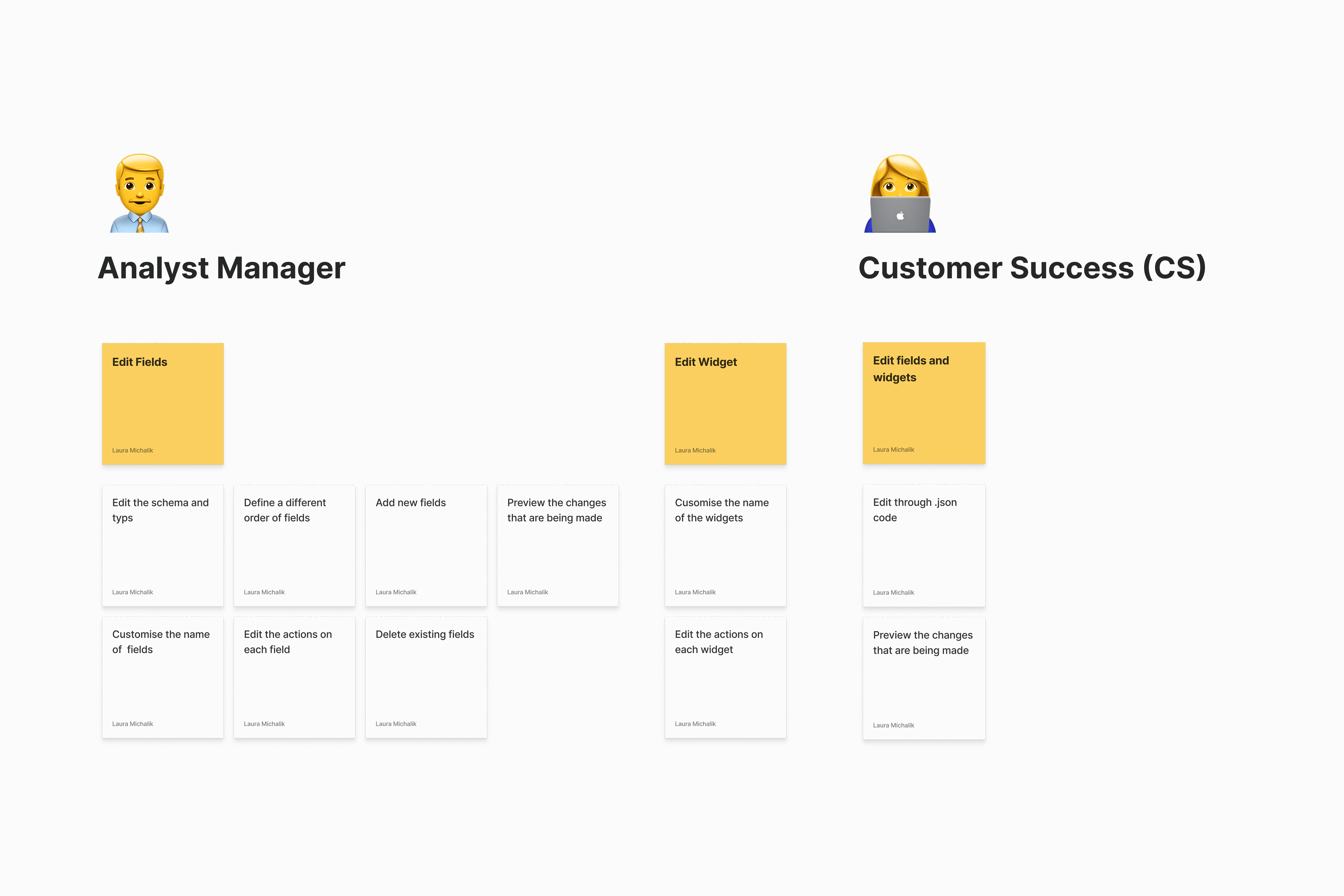
Project scope
After learning what users need in terms of customisation, together with the Project Manager, we decided what to focus on for the first version.
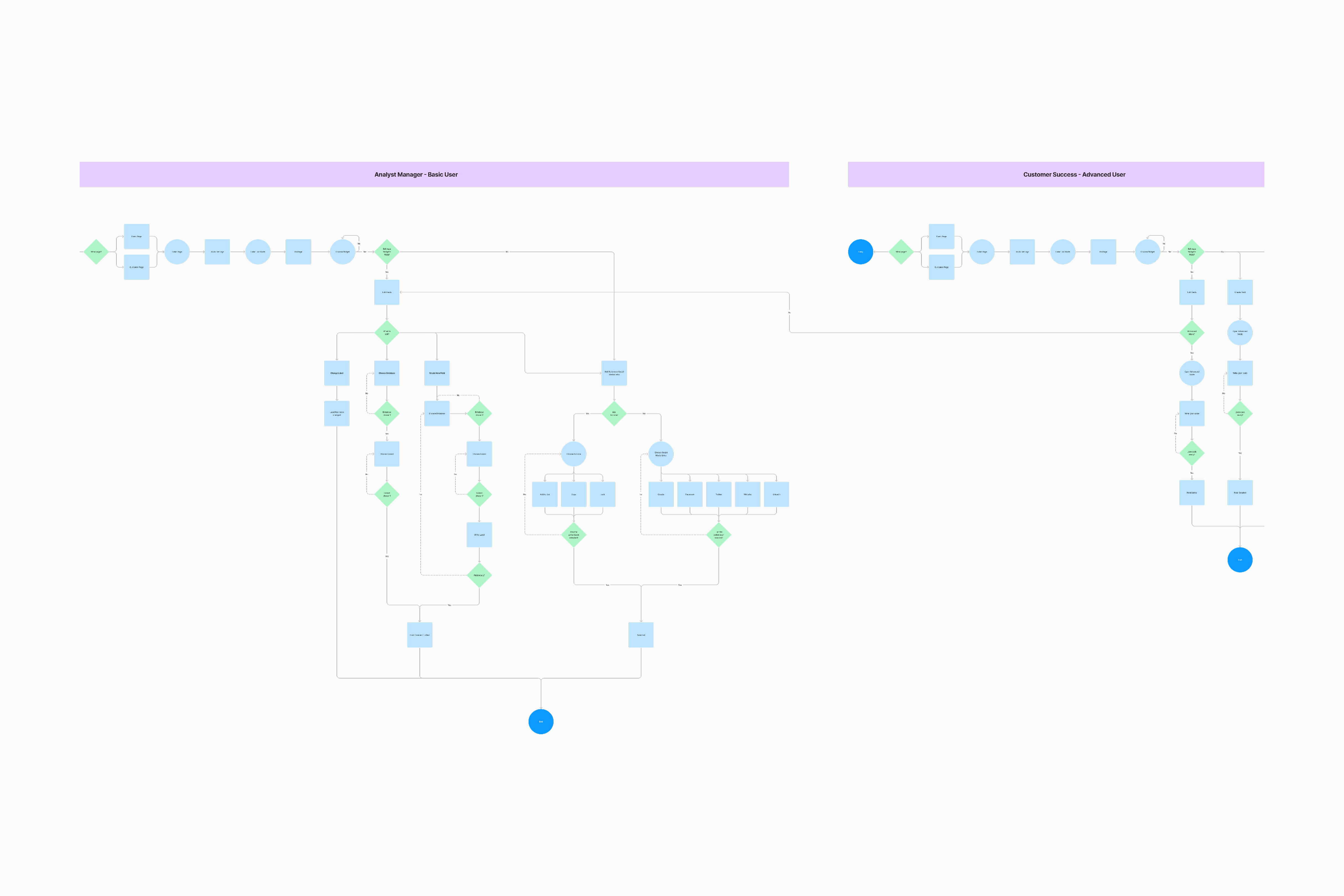
User flow
Creating an user flow allowed me to visualise the different steps users had to take in order to complete different tasks.
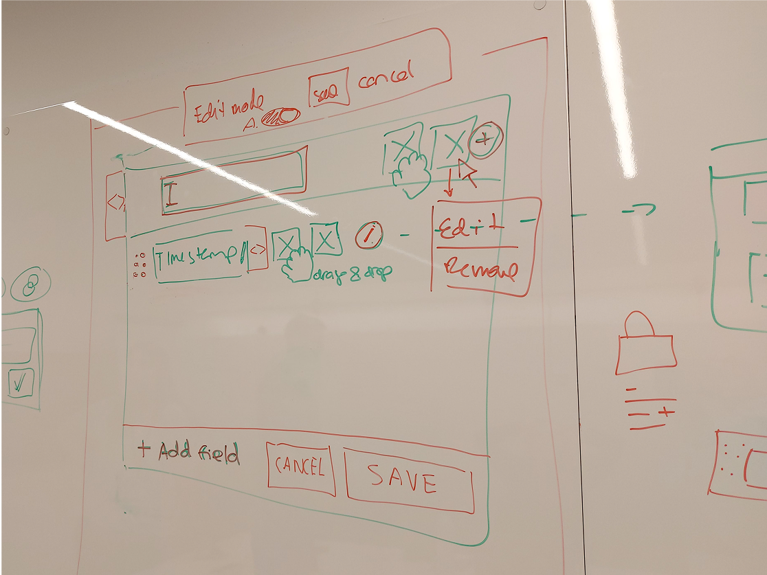
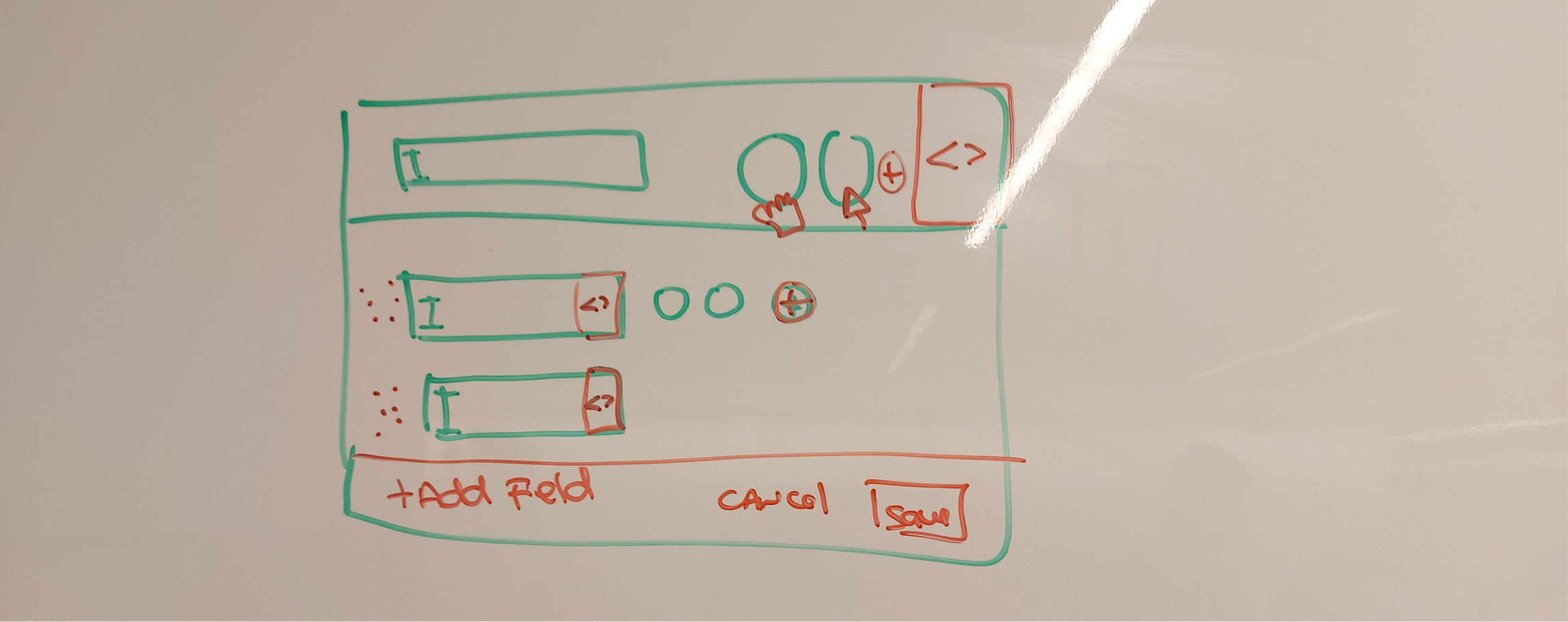
Ideation and design explorations
I spent some time alone and with fellow designers exploring different was in which users can edit fields and widgets.
Usability testing
& main insights
The prototypes were tested with 6 Analyst Managers and 3 Customer Success people.
100%
of managers did not understand the technical terms
On the other hand, 100% of CS users knew what those technical terms (schema and type) meant.
71%
of managers saw no relevance in using and advanced options
Editing through .json code was not important for their role. Some were even afraid of accidently breaking the system.
Before
Analyst Managers have full access to all the editing options, including advanced field and widget actions.
After
Restricted Analyst Managers' access to advanced features. Editing the code of an entire widget is a feature for customer success only.
Before
The copy on the advanced field modal is very technical catered towards developers, not Analyst Managers.

After
Updated copy catered towards Analyst Managers. "Schema" is now "Database". "Type" is now "Format". They're simple changes, but it's easier to understand.
Final designs #1:
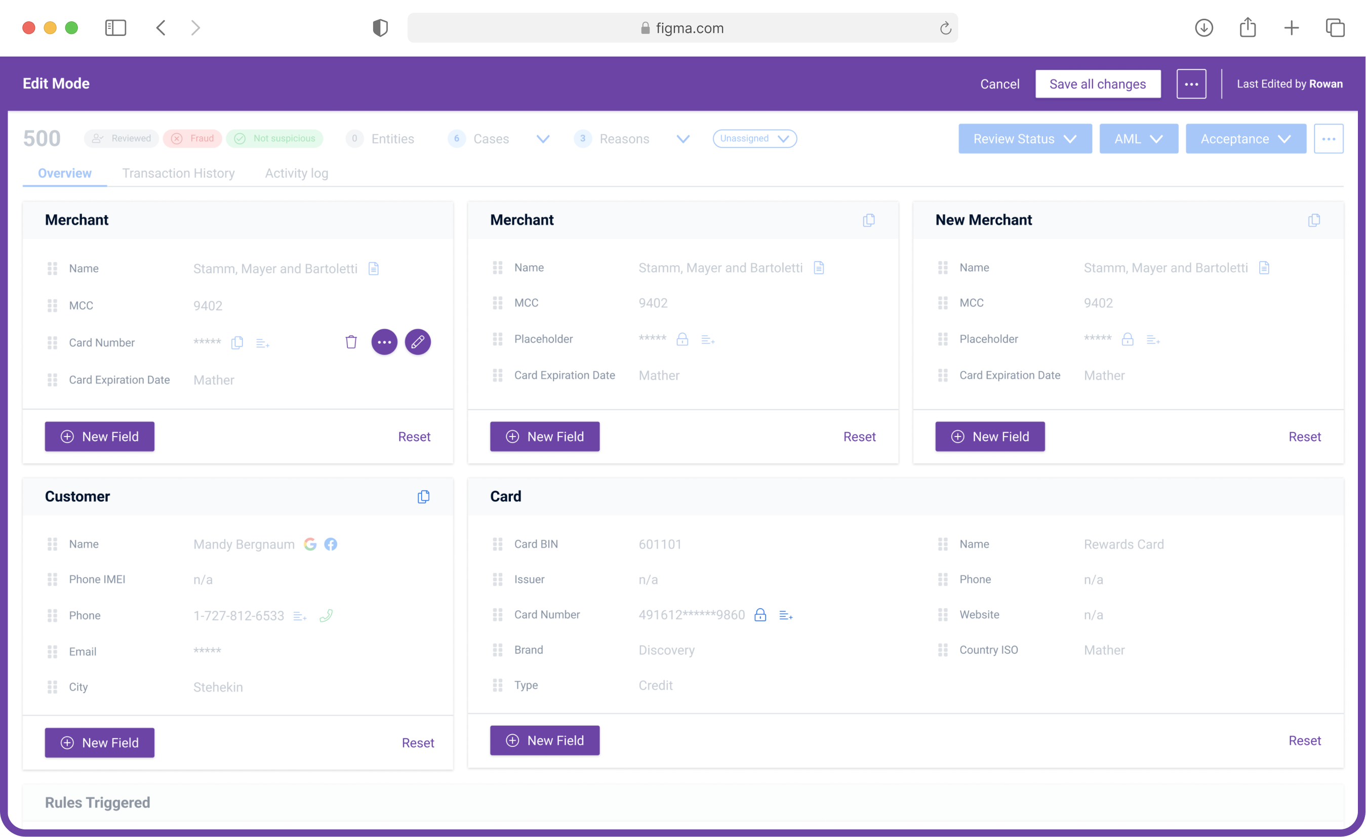
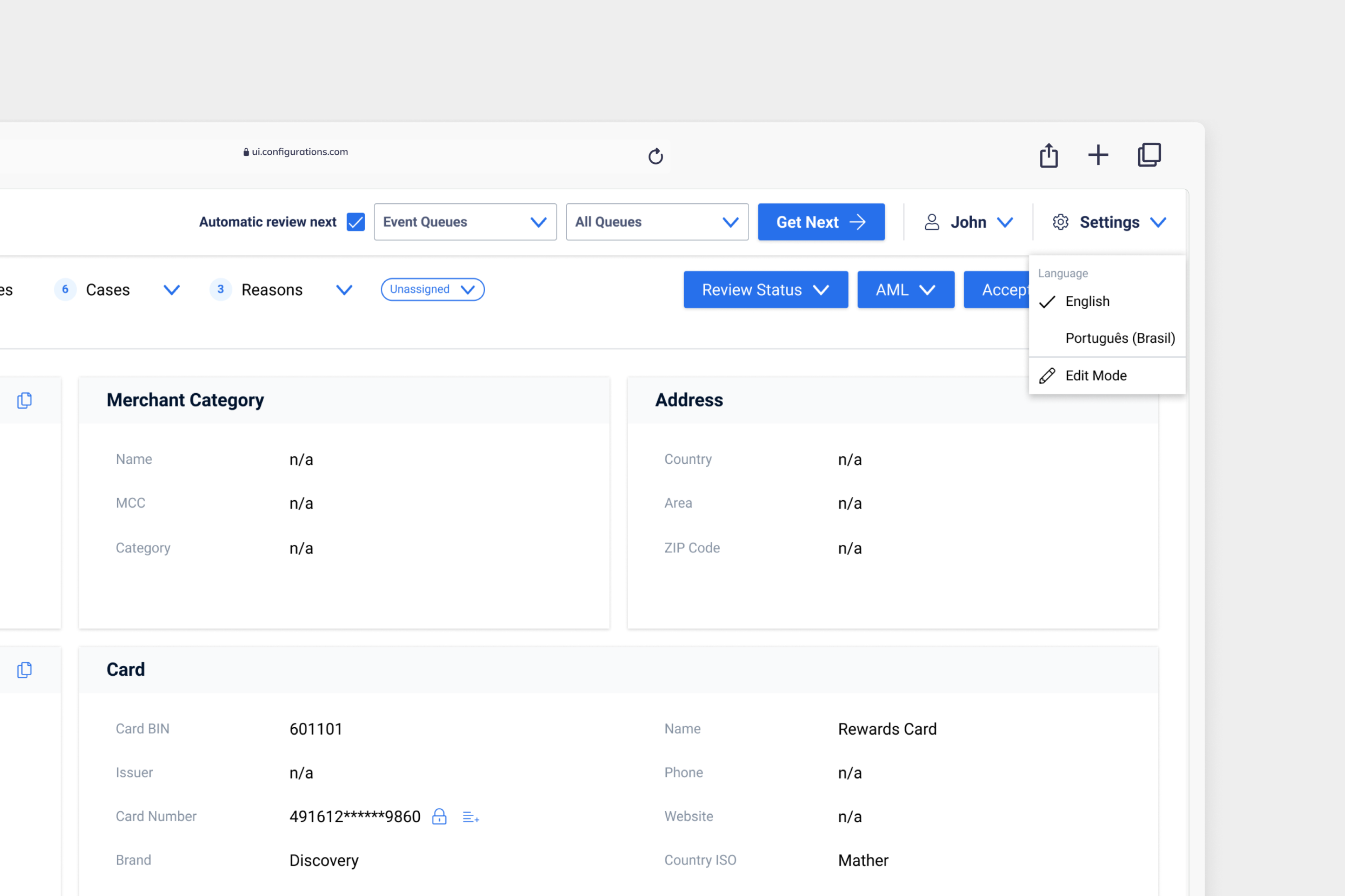
Entering edit mode
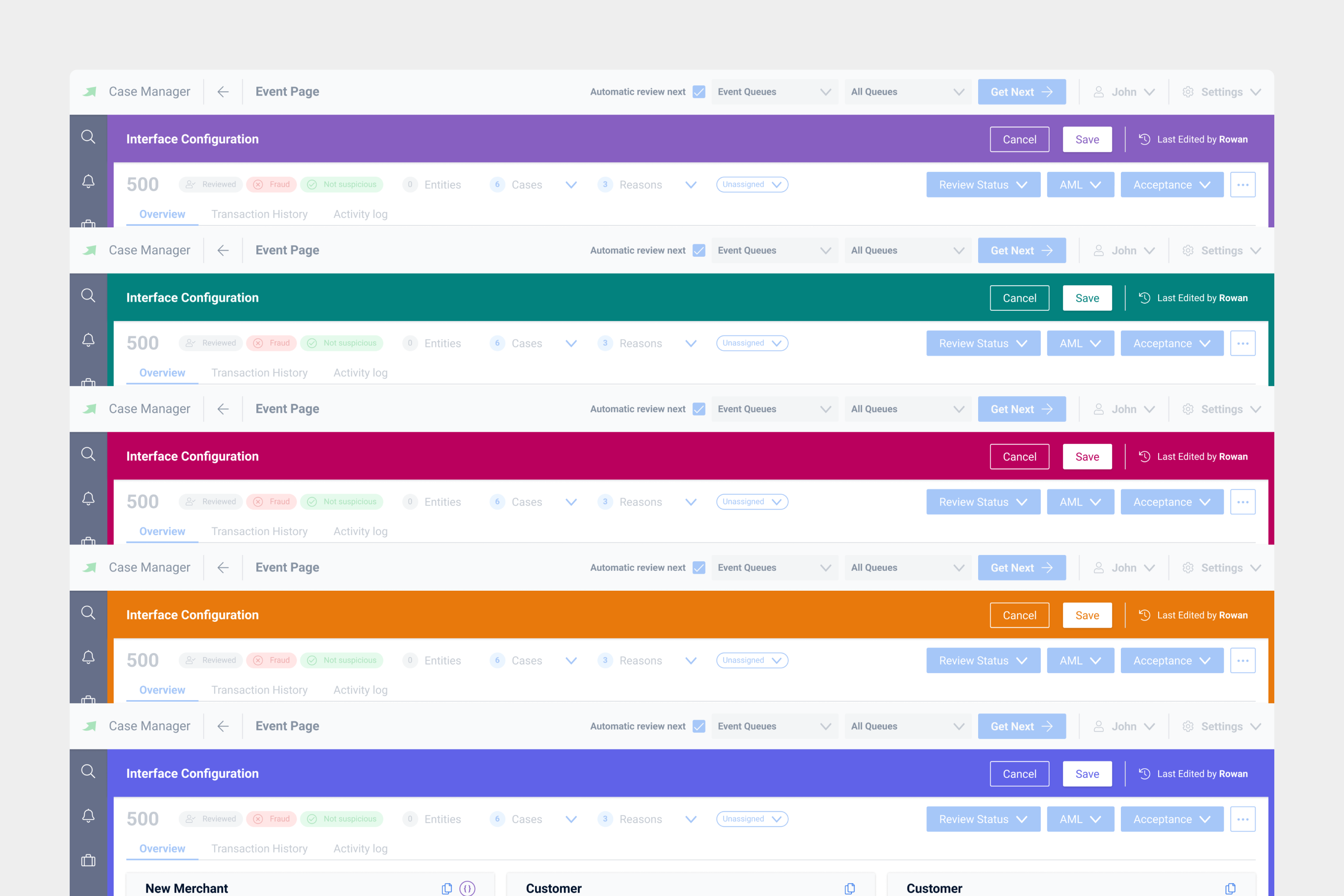
Viewing the dashboard to fight fraud is one thing, editing the dashboard is a completely different action. Given that it isn't something that needs to be done all the time, it was placed under 'Settings'.
Final designs #2:
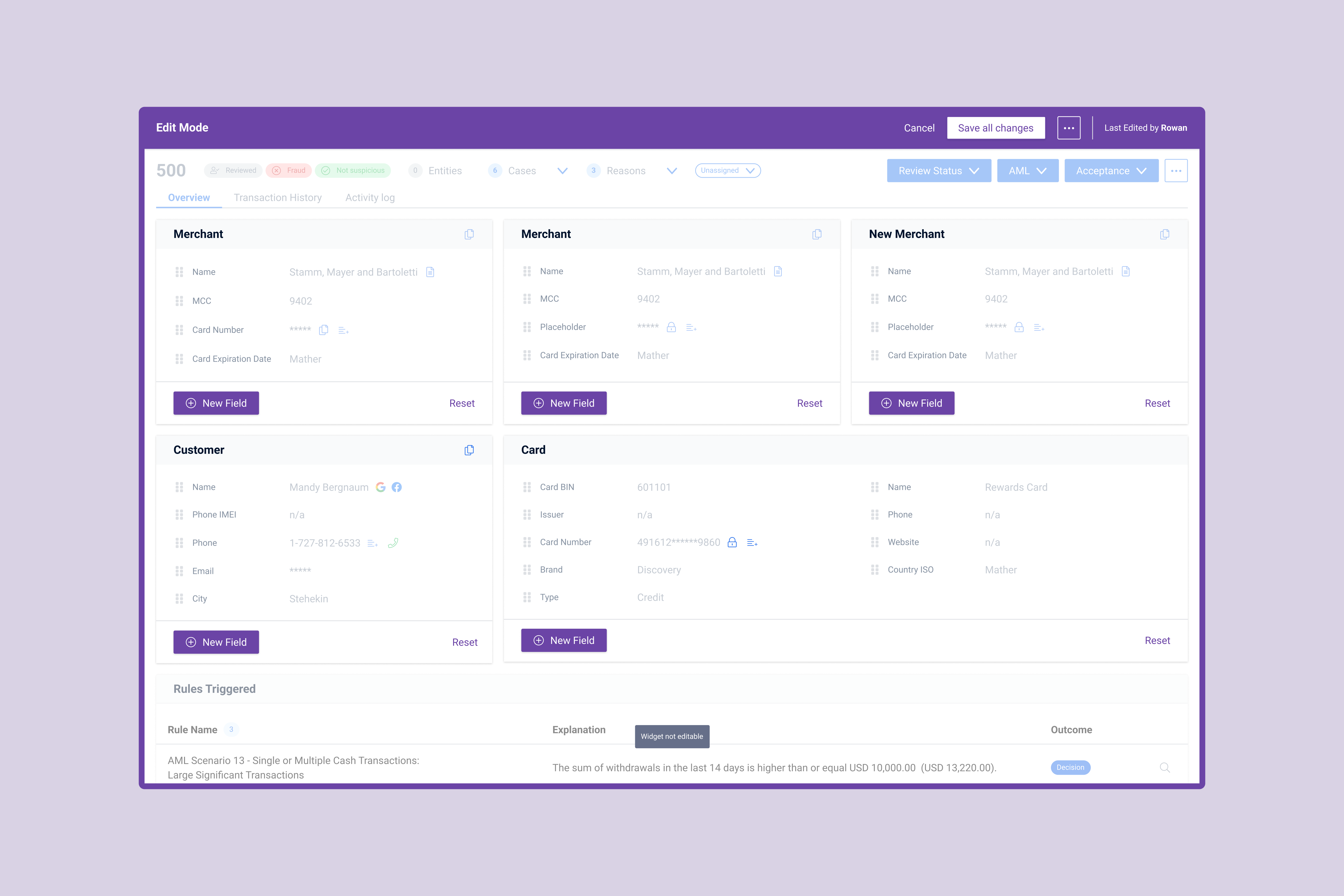
Arriving to edit mode
Edit mode is a completely different experience, which is why it should look different from the rest of the product. The purple colour selected is part of the brand secondary colours and not used anywhere else. From this point on, the purple colour has became synonymous with 'edit mode'.
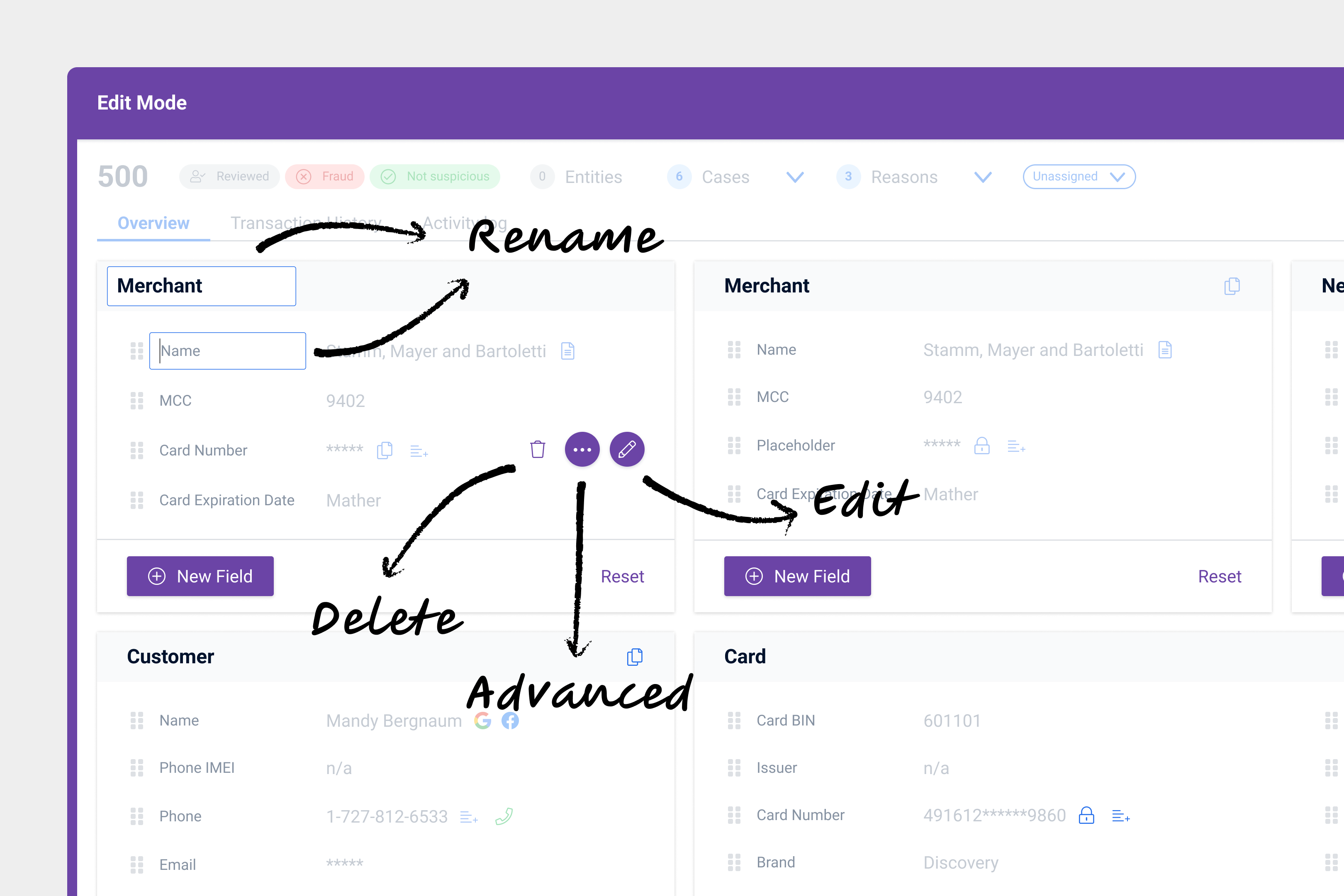
Final designs #3:
Toolbar with actions
Around the time I was designing this new feature, the Design Systems team was making progress with the new Figma Library. In order to follow the new guidelines and principles some major UI changes were made.
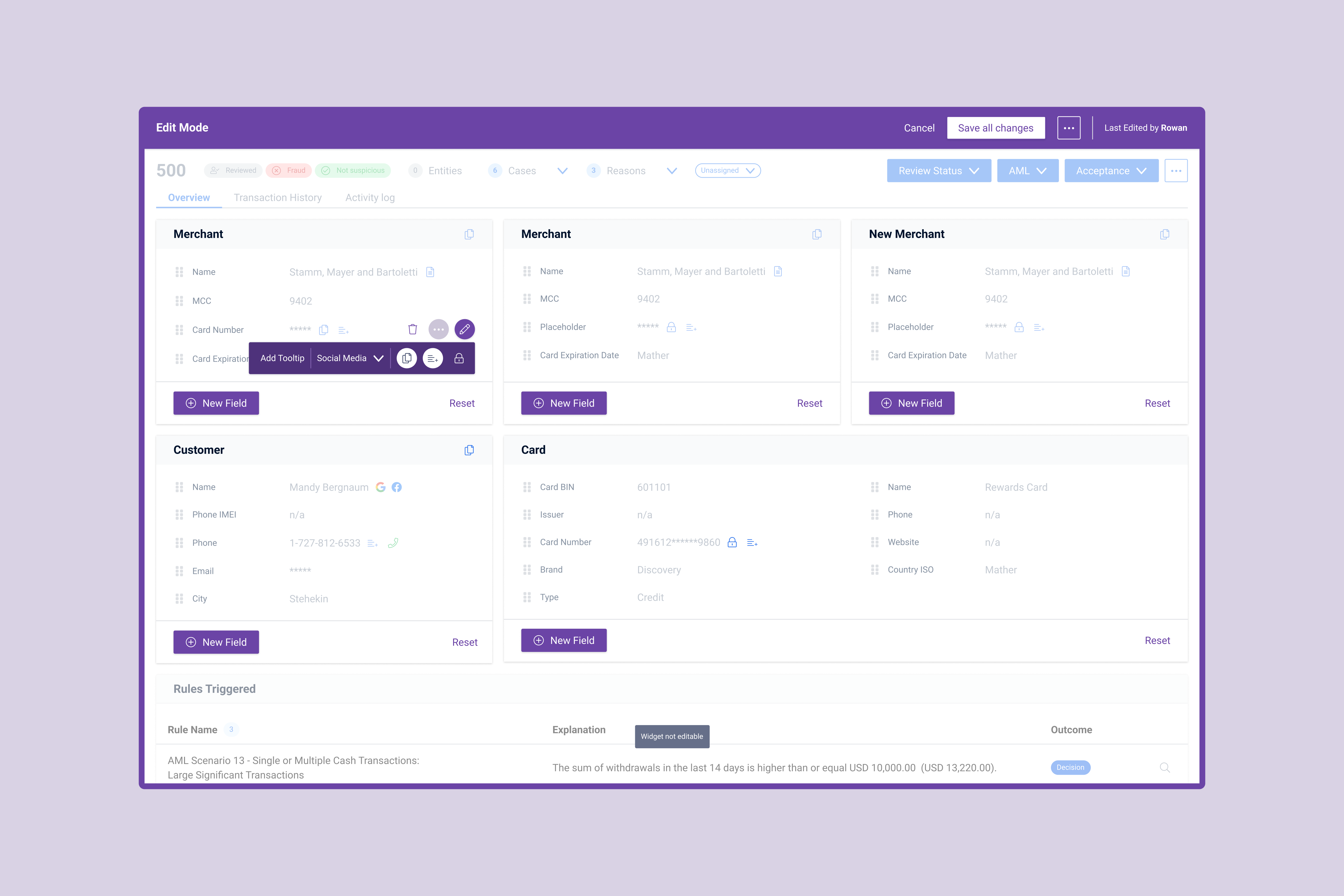
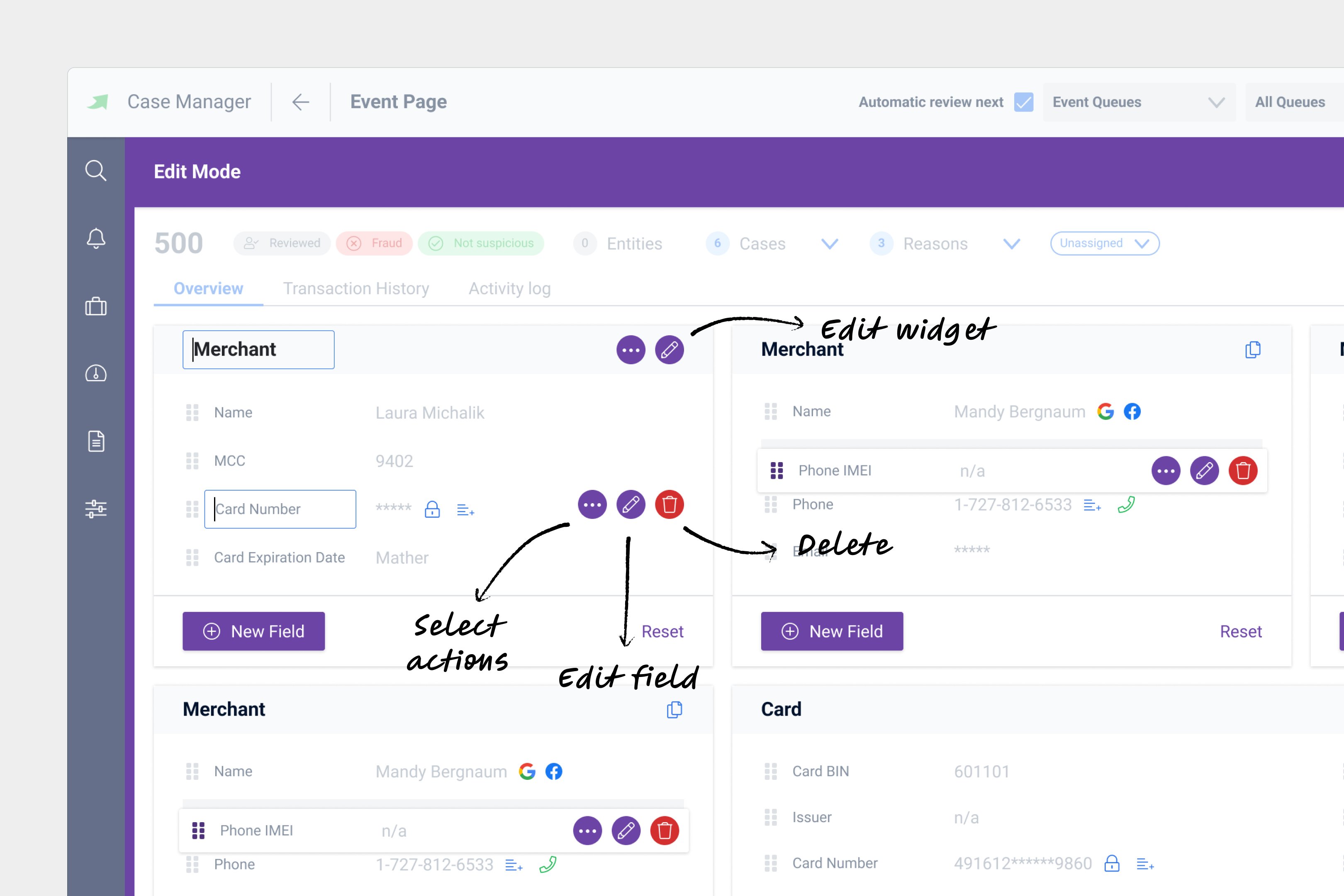
Toolbar with actions
The toolbar includes all basic editing actions – add tooltip, select social media links and actions related to fraud detection (copy names or card information or add information to a list). Keeping all editing actions in a single toolbar allows users to easily edit a field without having to leave it.
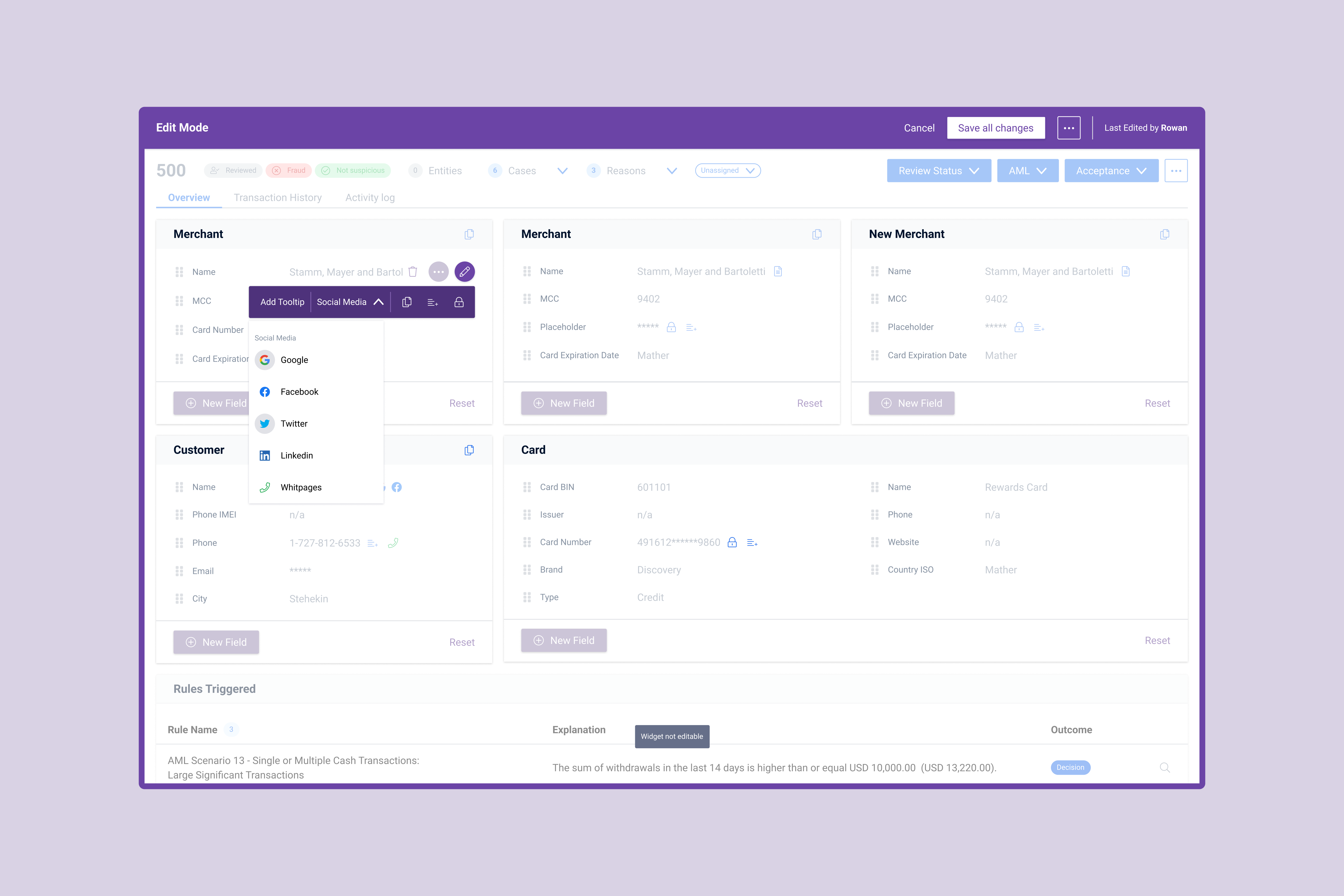
Select social media links
There is a selected amount of social media links available, which are available on identity fields. Analyst Managers can select social media links from a set list.

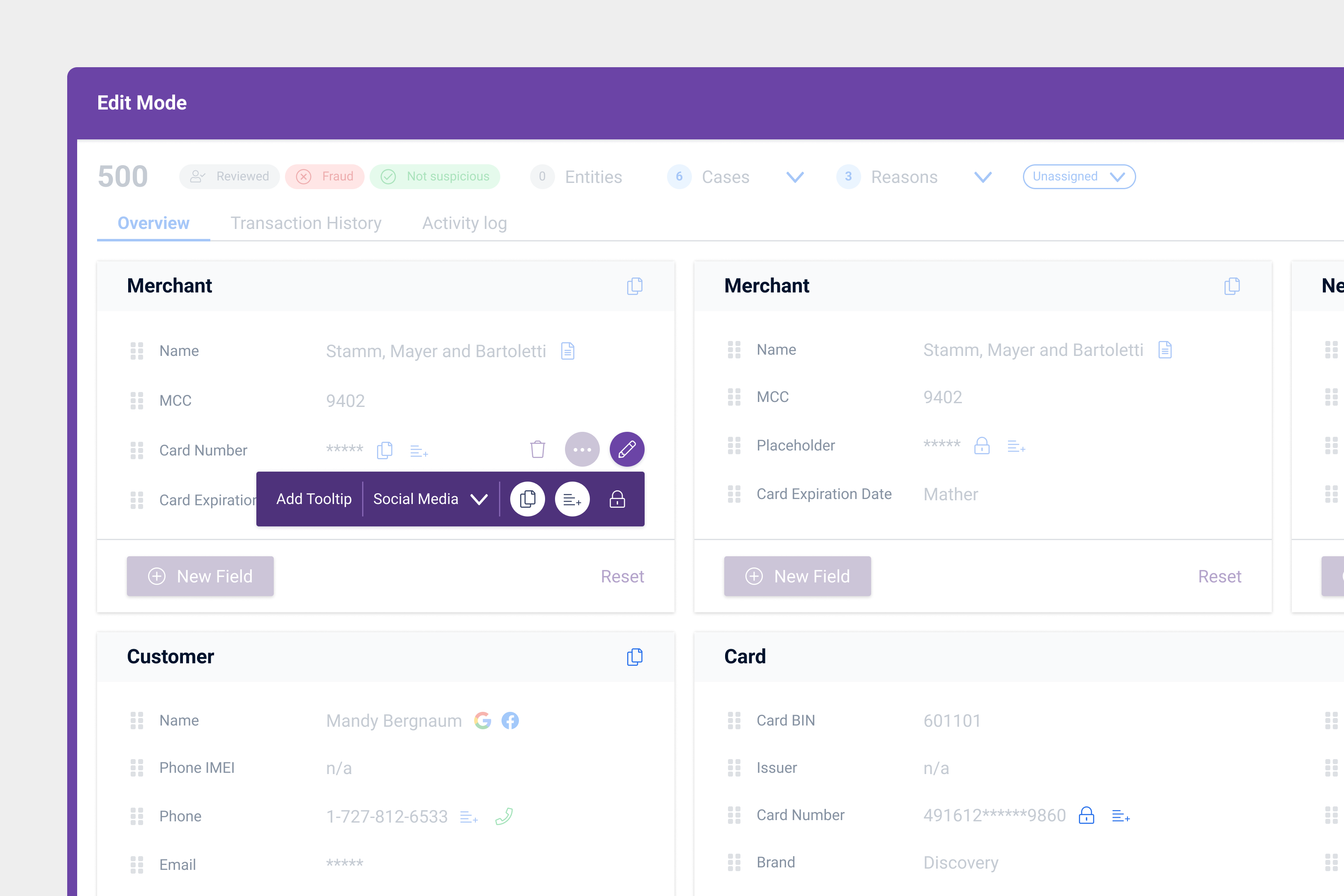
Select and unselect actions related to fraud detection
Each field can have specific actions – mainly copy or add to list. Analyst Managers can select and unselect whatever actions they want.
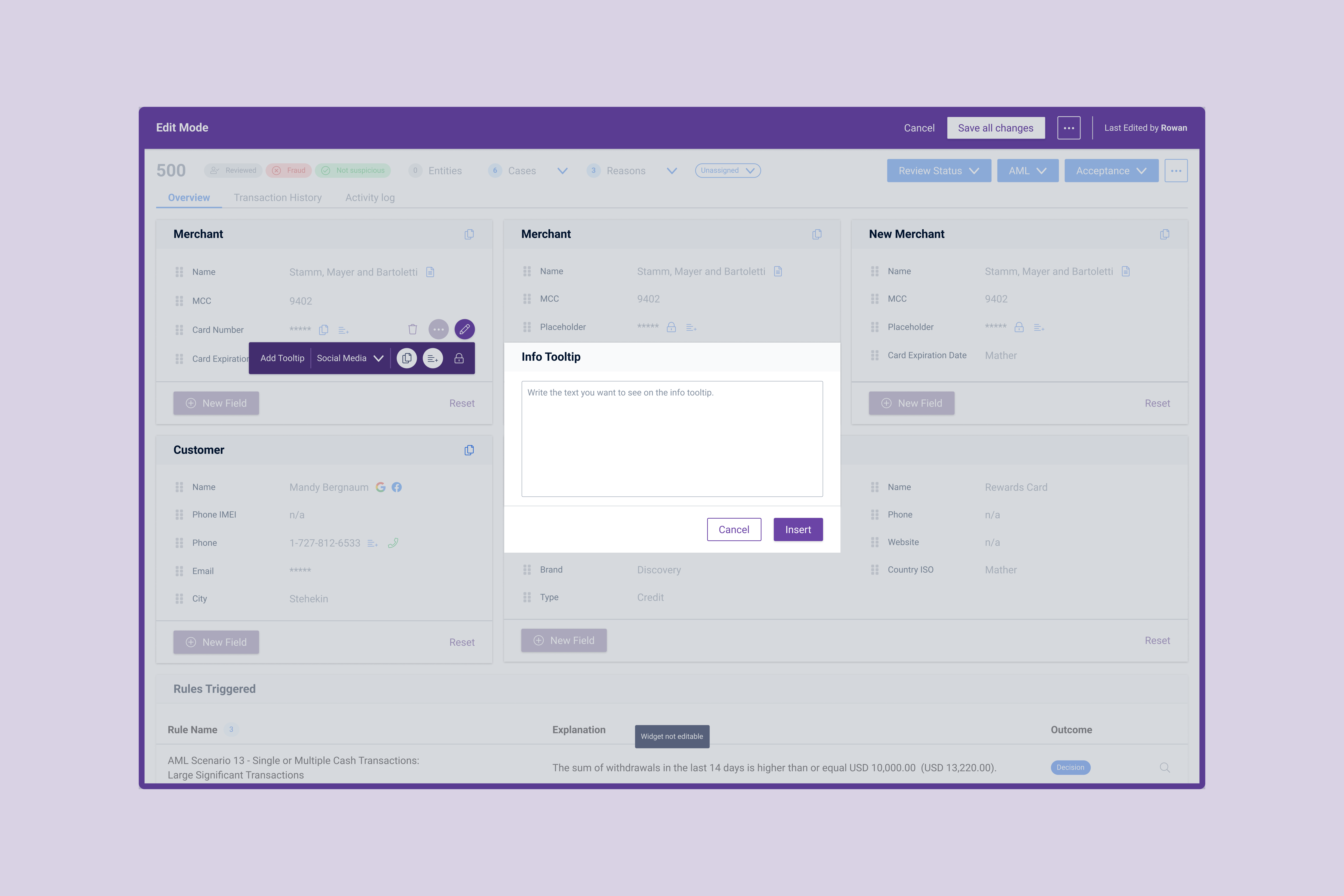
Add tooltip to a field
Some fields need additional information in order for Analysts to understand it better. Given that the text can vary from being small to quite long, a modal was chosen in order to allow users to write the text comfortably.
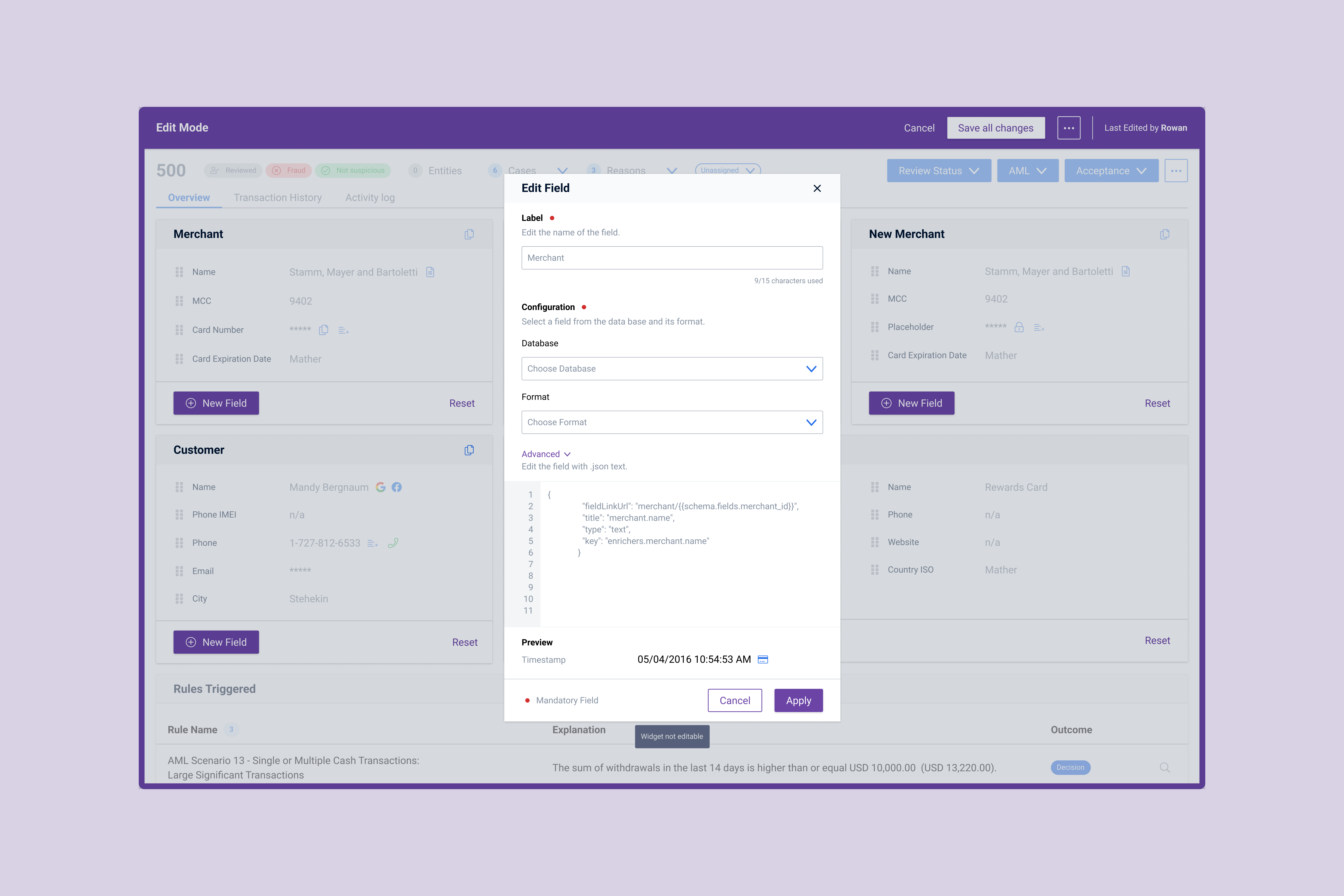
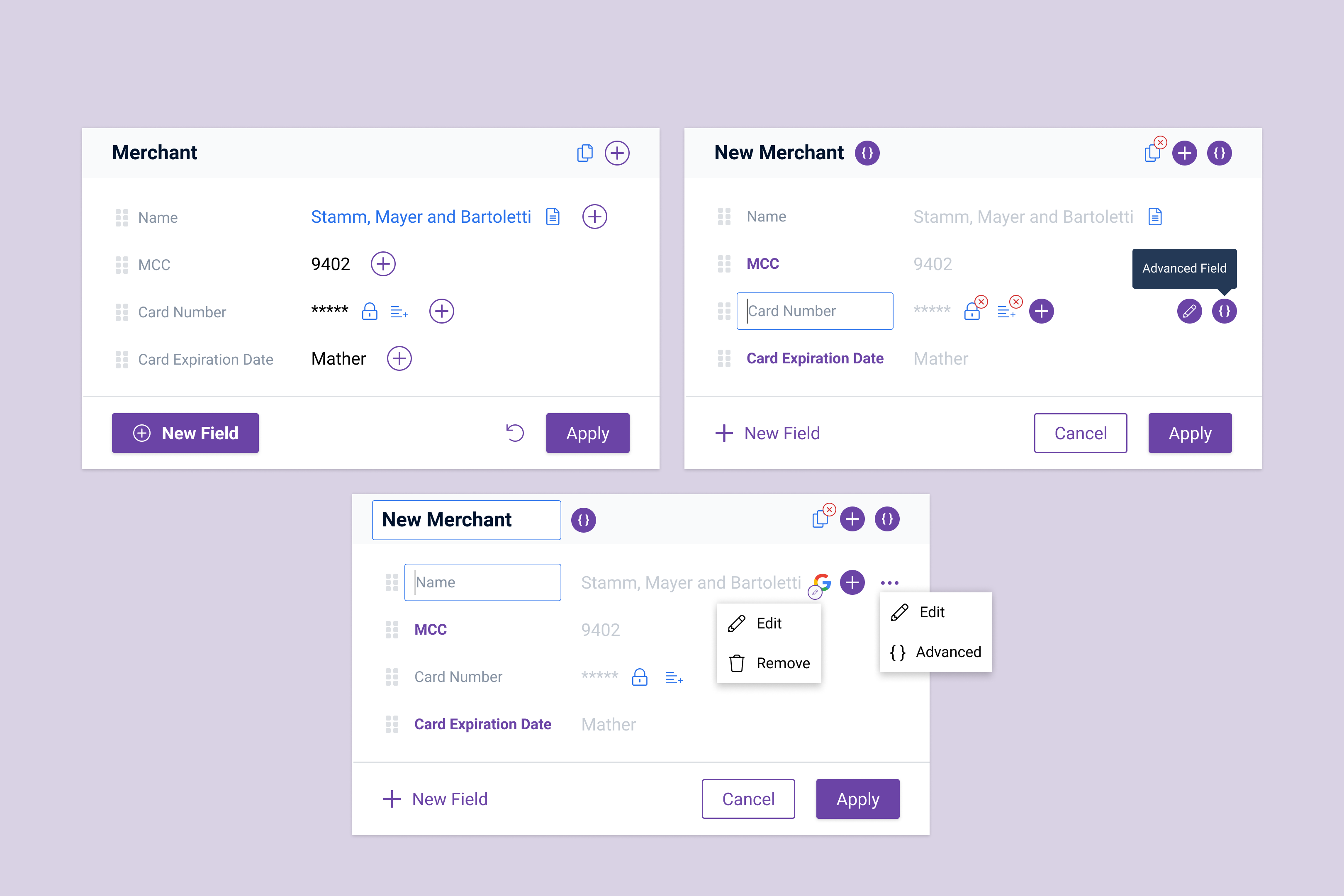
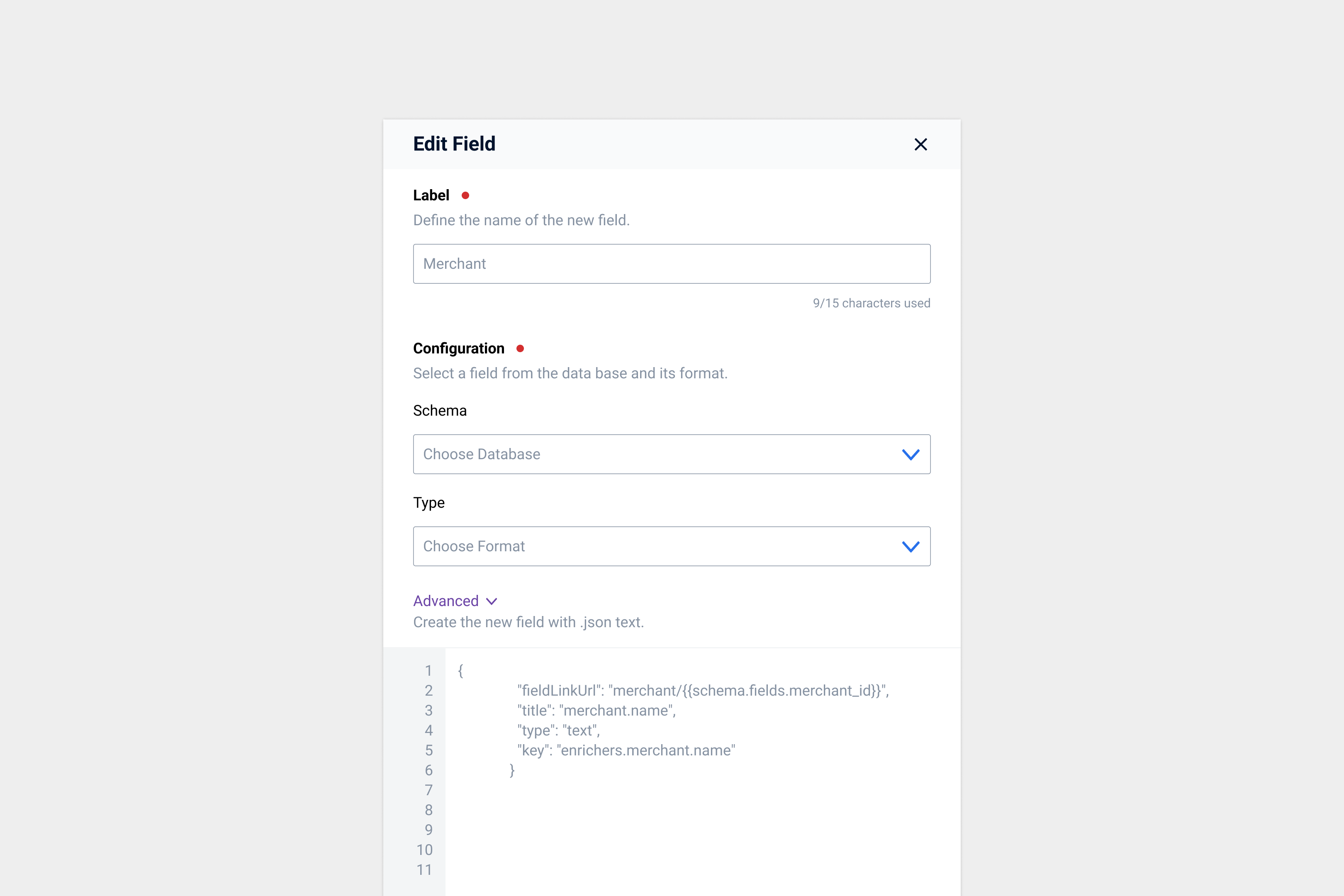
Advanced: edit field
Even though Analyst Managers don't want the ability to edit an entire widget in fear of breaking something. However, they sill want the ability to edit individual fields.
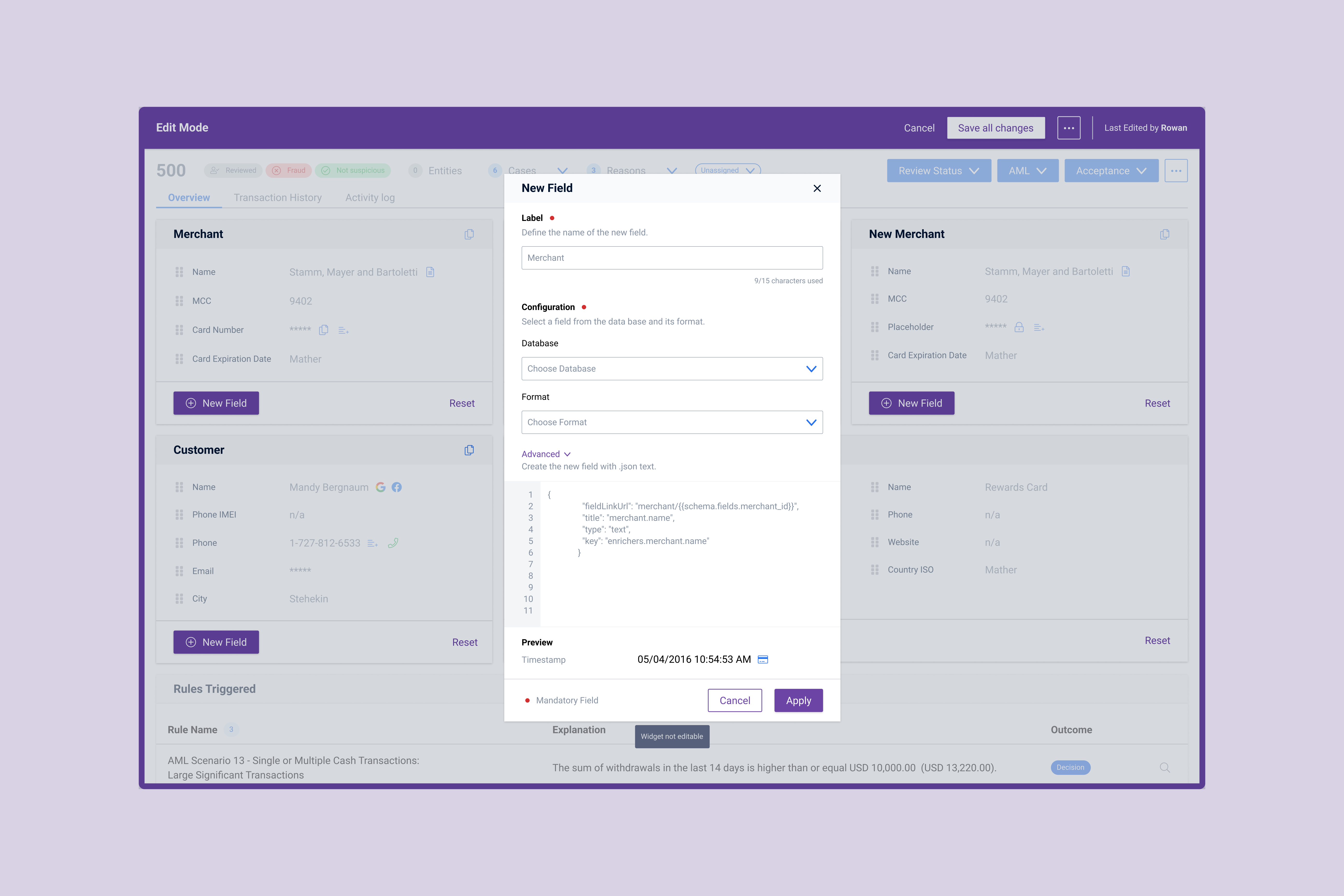
Create a new field
To create a new field users have select a database/schema and format/type. Without those inputs it isn't possible to create it. Since it is a job that requires focus, the modal allows users to focus on the task at hand and not get distracted by other actions on the page.