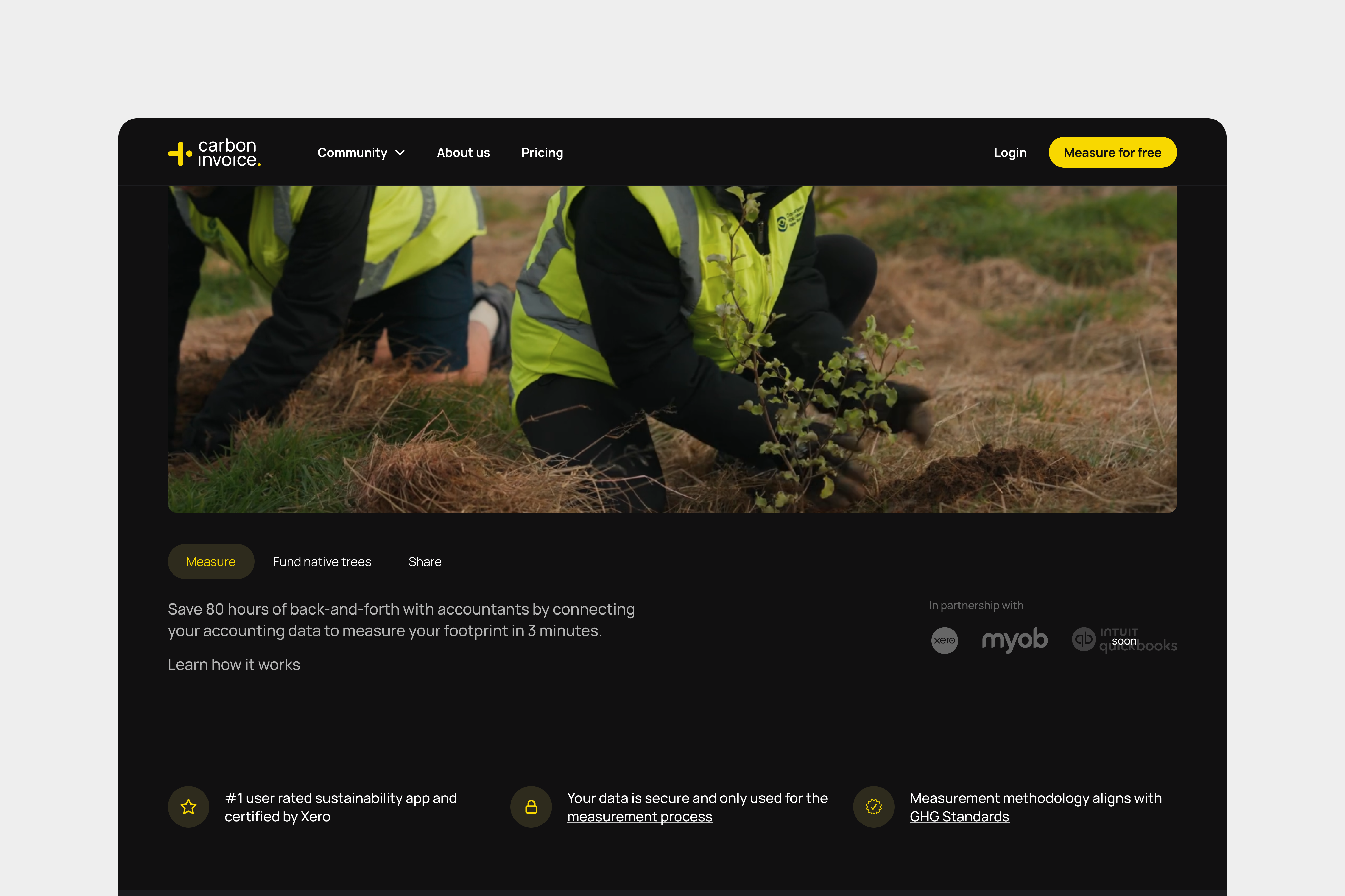
CarbonInvoice
Yellow – Style Guide
To keep the website's visual language consistent, I put together a style guide that contains styles and components that are to be used throughout the entire website.
Problem
Having multiple components and classes doing the exact same thing has made it harder to rapidly scale the website.
Solution
Build a style guide in Webflow with reusable classes, typography, colours and components.
UX Audit
Before I started building the style guide, I did an audit of the entire website and found some issues.
01
More than 1 class for secondary and link buttons with the same look
A lot of time is wasted trying to figure out which button is the right one.
02
6 different cards that do similar jobs
Different CMS Collections have different needs, but the look and feel was the same. It was getting confusing which card to choose.
03
No proper colour sytem
What colours can we use on text, backgrounds, borders? There were too many colours being used.
04
5 different types of sliders with different classes doing the same job
It's hard to figure out which slider is the one that should be used, as well as the code that should go with it.
Approach
Before I started building the style guide, I did an audit of the entire website and found some issues.
01
Define primitive variables & define variables
Once the primitives are defined, scaleit to the typography, colour usage, borders, among others.
02
Update the existing components with the new variables
Using the new system, update the typography, buttons, tabs and so on.
Figma library
I used Figma to explore the typography, colours and spacings before updating it in Webflow.
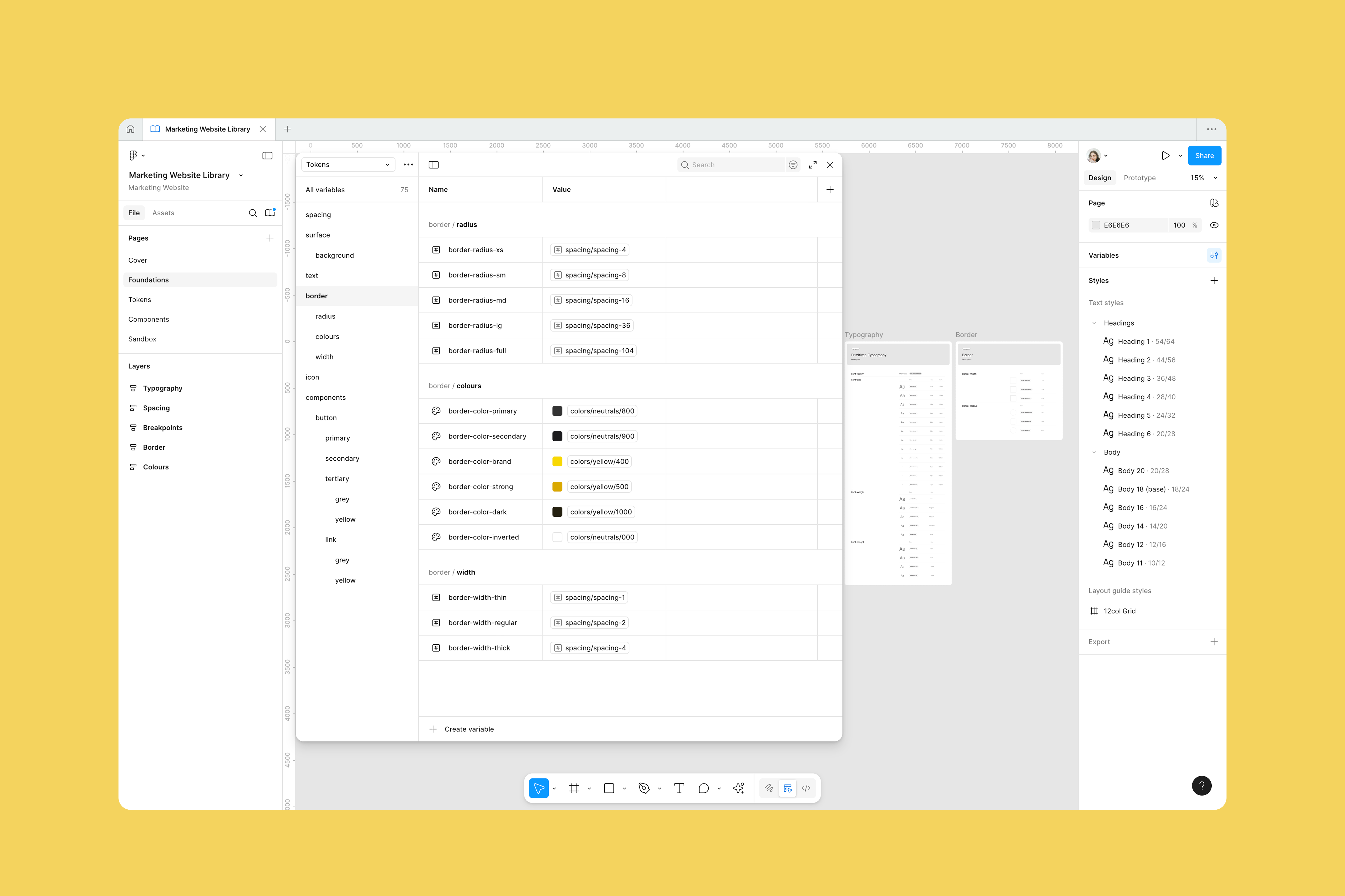
Variables system
Defined primitives to be used on the variables.
Final style guide
After spending a few hours a week updating the look & feel, and updating it in Webflow, I landed on an improved version of the interface.
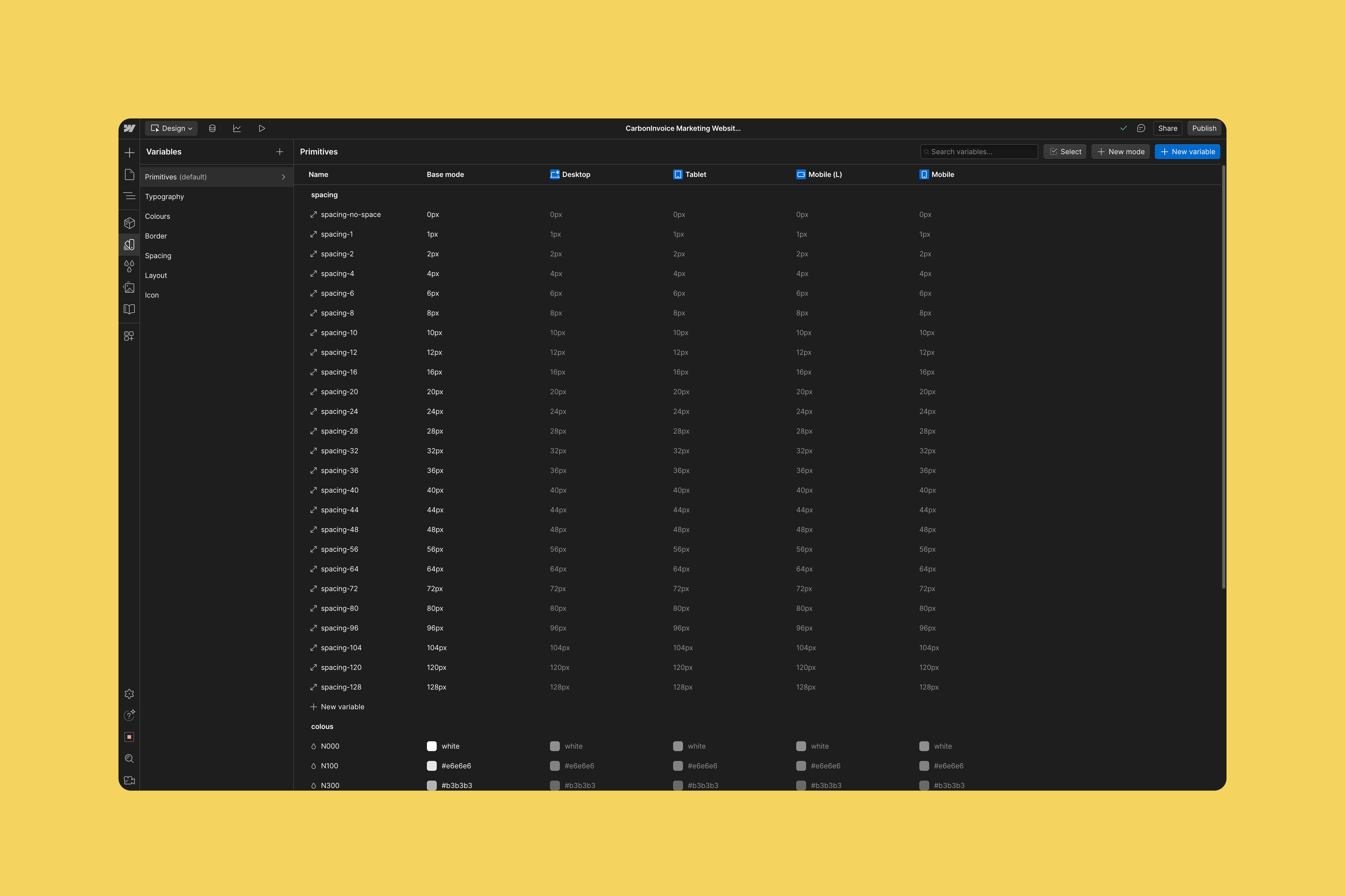
Variables system
Defined primitives to be used on the variables.
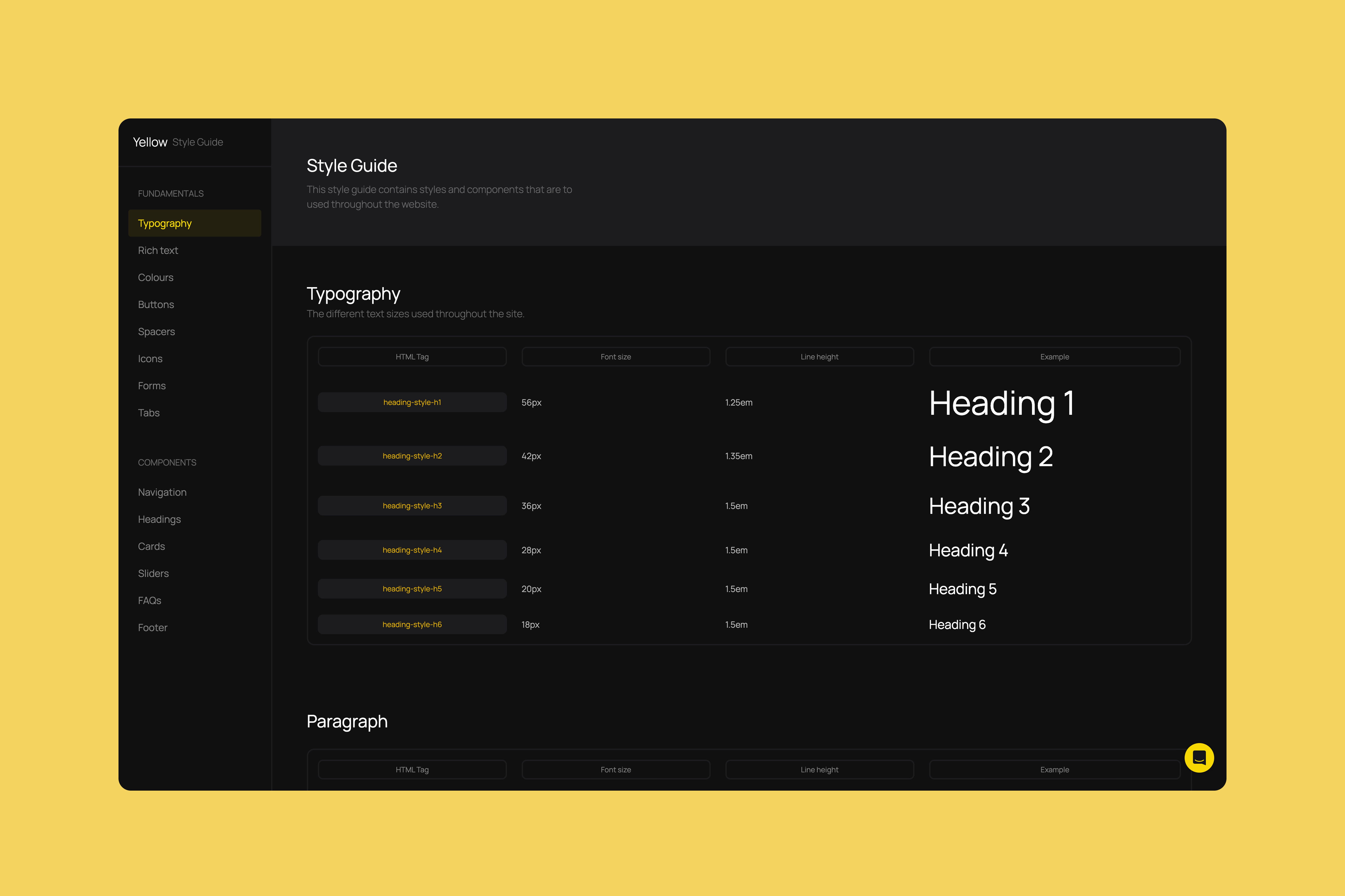
Typography hierarchy
The different text sizes used on headings and paragraphs.
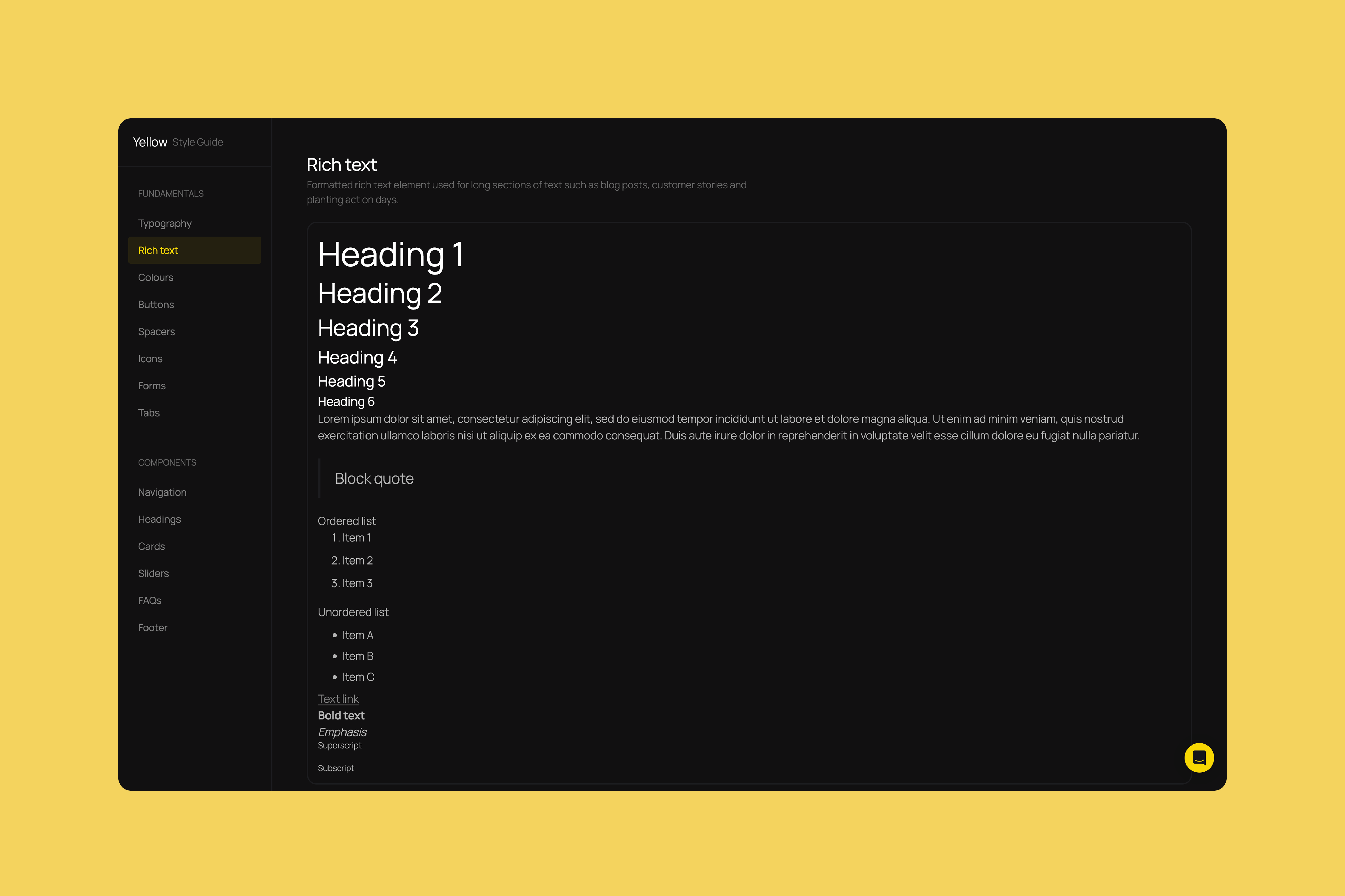
Rich text
Used in blog, customer stories, webinars and planting action days.
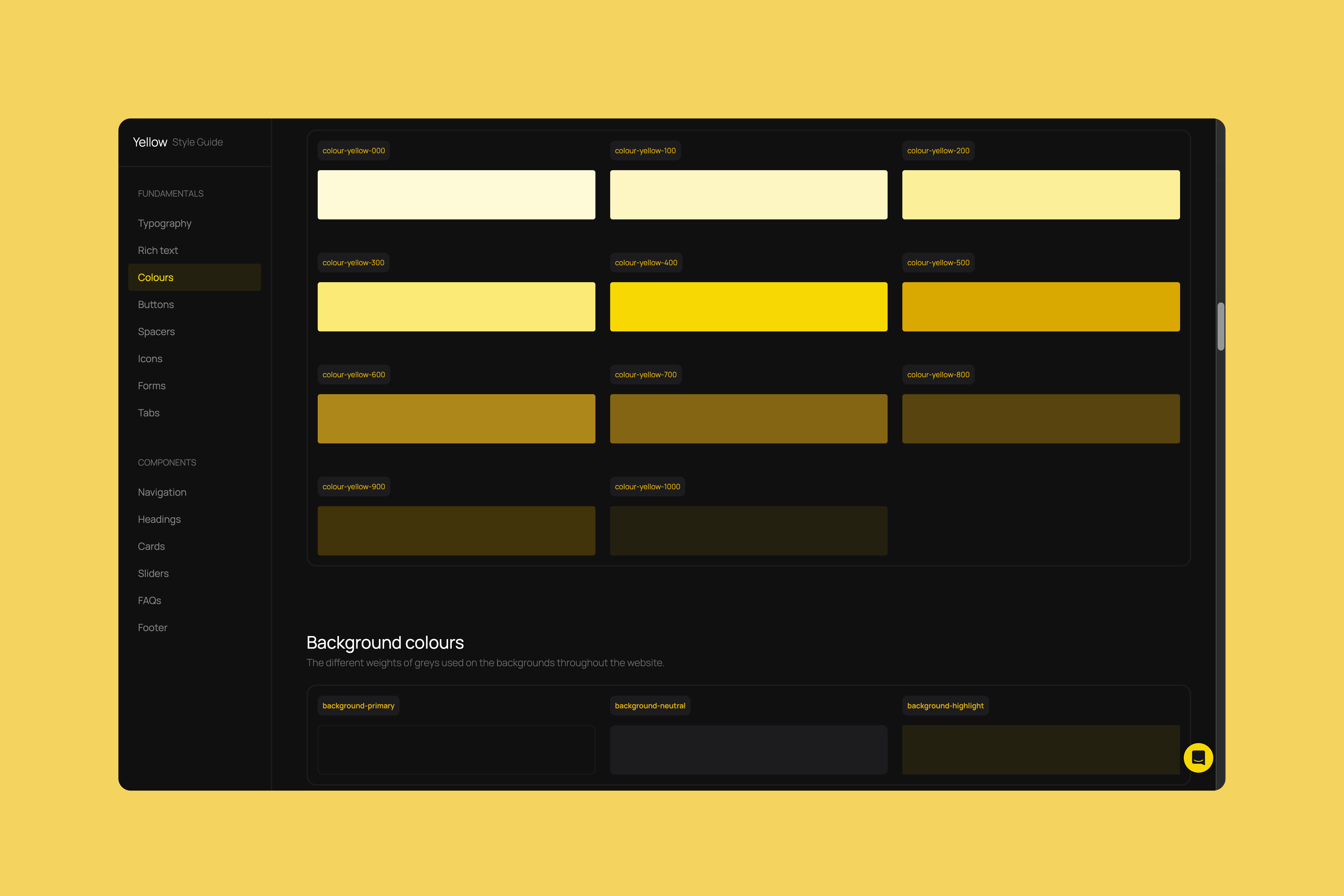
Colours
The different weights of greys and yellows used throughout the website.
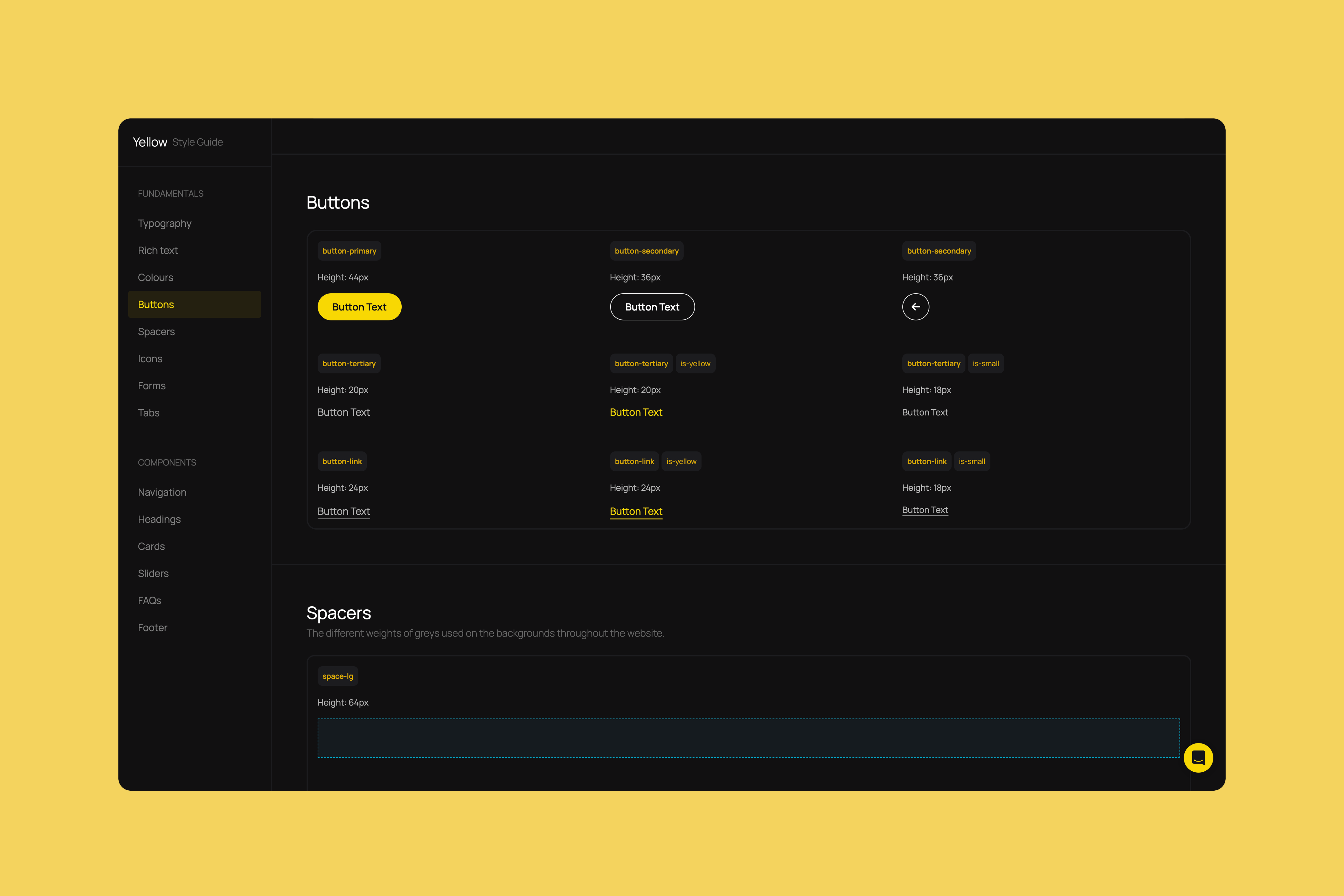
Buttons
System for primary, secondary, tertiary and link buttons with their respective variables.
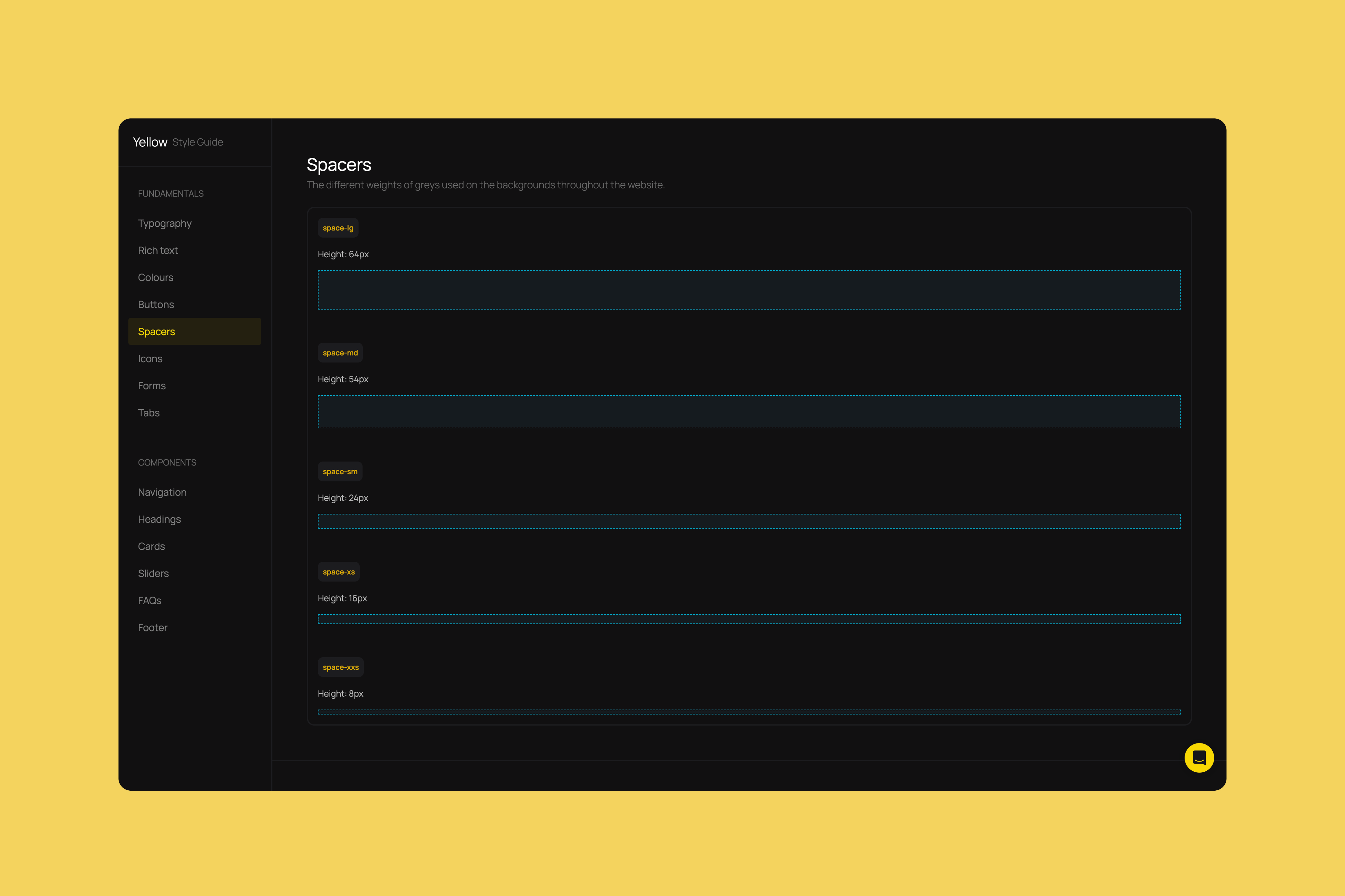
Spacers
Spacer elements using the 8-pt system to give sections more room to breathe.
Icons
The different sizes icons should follow.
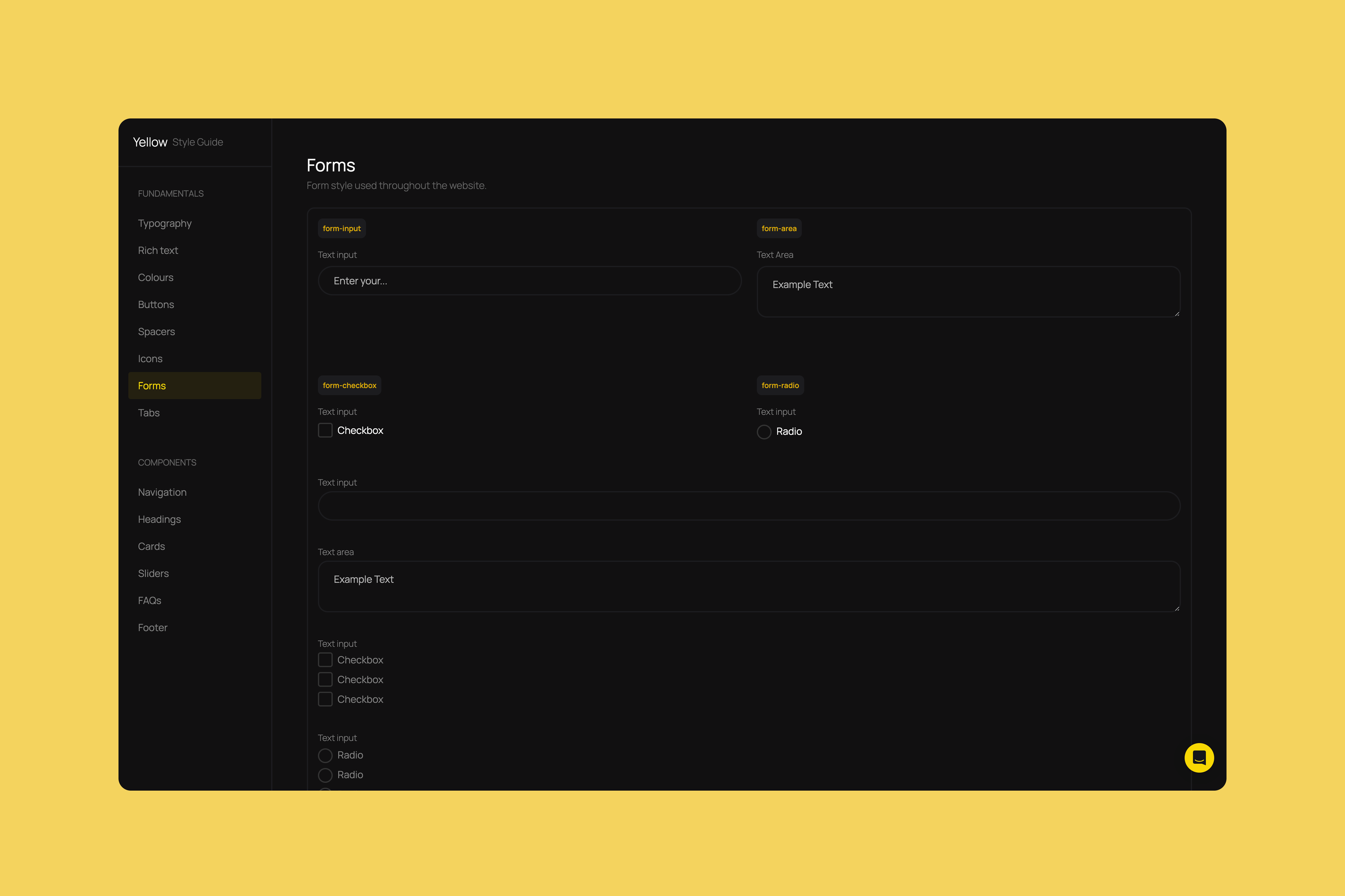
Forms
Text inputs, areas, checkbox and radio buttons defined. This is the style that needs to be followed on ActiveCampaign forms as well.
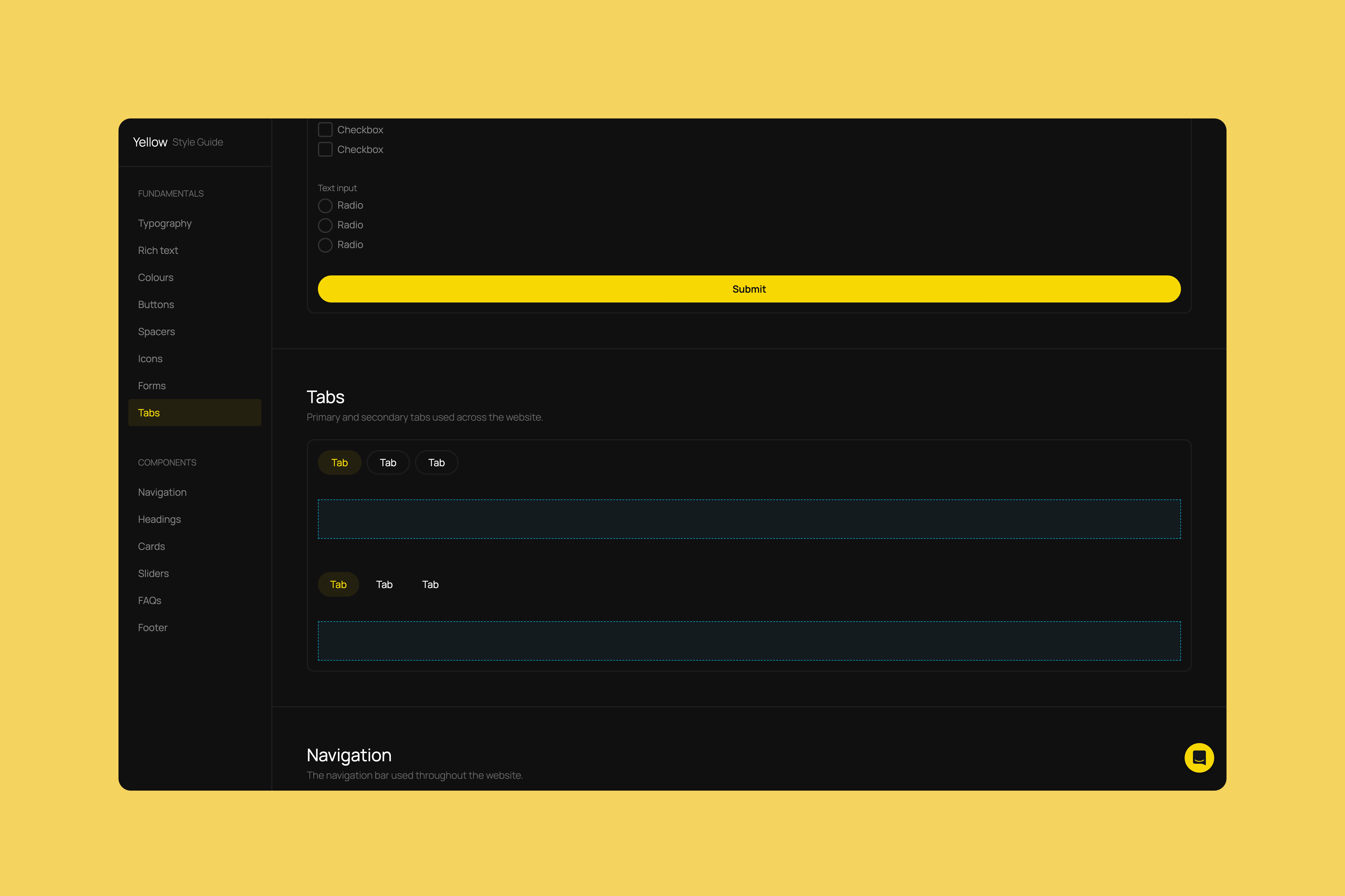
Tabs
2 types of styles tabs should follow.
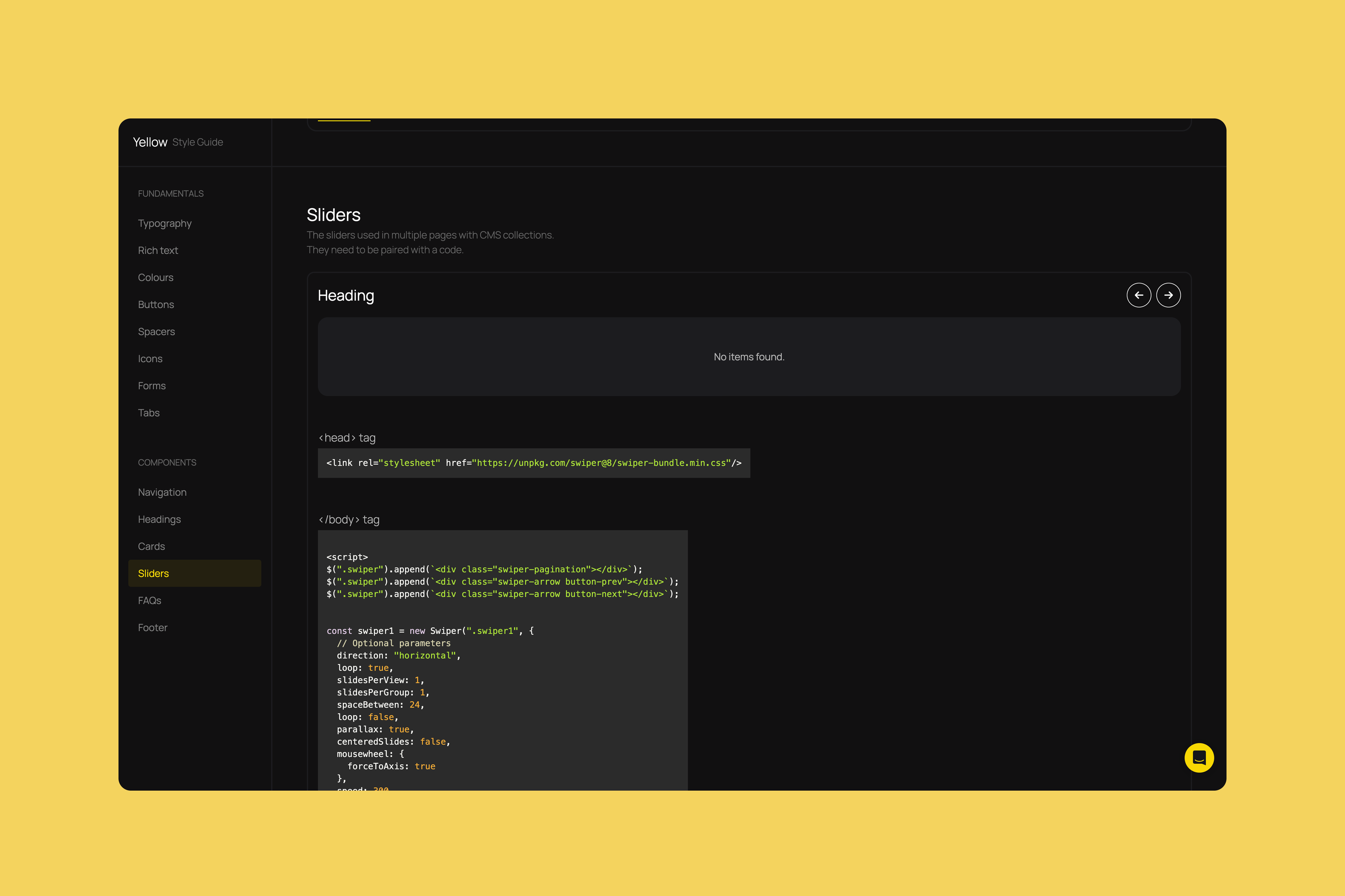
Components – Sliders
Included any necessary code for components that require on scripts to work.