CarbonInvoice
CarbonInvoice – Homepage Redesign
Every business needs an website, an updated one at that. That’s why we’re continuously improving the way we present our value proposition, so that it will resonate with the right audience.
Problem
The redesign of the landing page came after data and conversations with prospects revealed problems with how we were communicating our value proposition.
Solution
Design a new landing page improving the way we communicate the value proposition in a way that resonates with visitors.
Context
The redesign of the landing page came after data and conversations with prospects revealed problems with how we were communicating our value proposition. The website is the first touchpoint many prospects have, so it's important that we communicate clearly how we can solve their problems.
User research
results & insights
To better understand the issues with the current website I analysed data from GA4 and paired it with user interviews conducted by the team. There were a lot of learnings usability insights – they're on the image below.
01
We’re communicating our internal mission and brand values, not fully answering user’s needs.
02
Our language and carbon actions aren’t resonating with the majority of visitors.
03
We’re not communicating enough how our technology/product does all the heavy lifting.
04
The website converts carbon literate people, not the average person – We’re not focusing on our target audience.
05
Not enough visibility on where the native trees are being funded can cause customers to church (has recently happened).
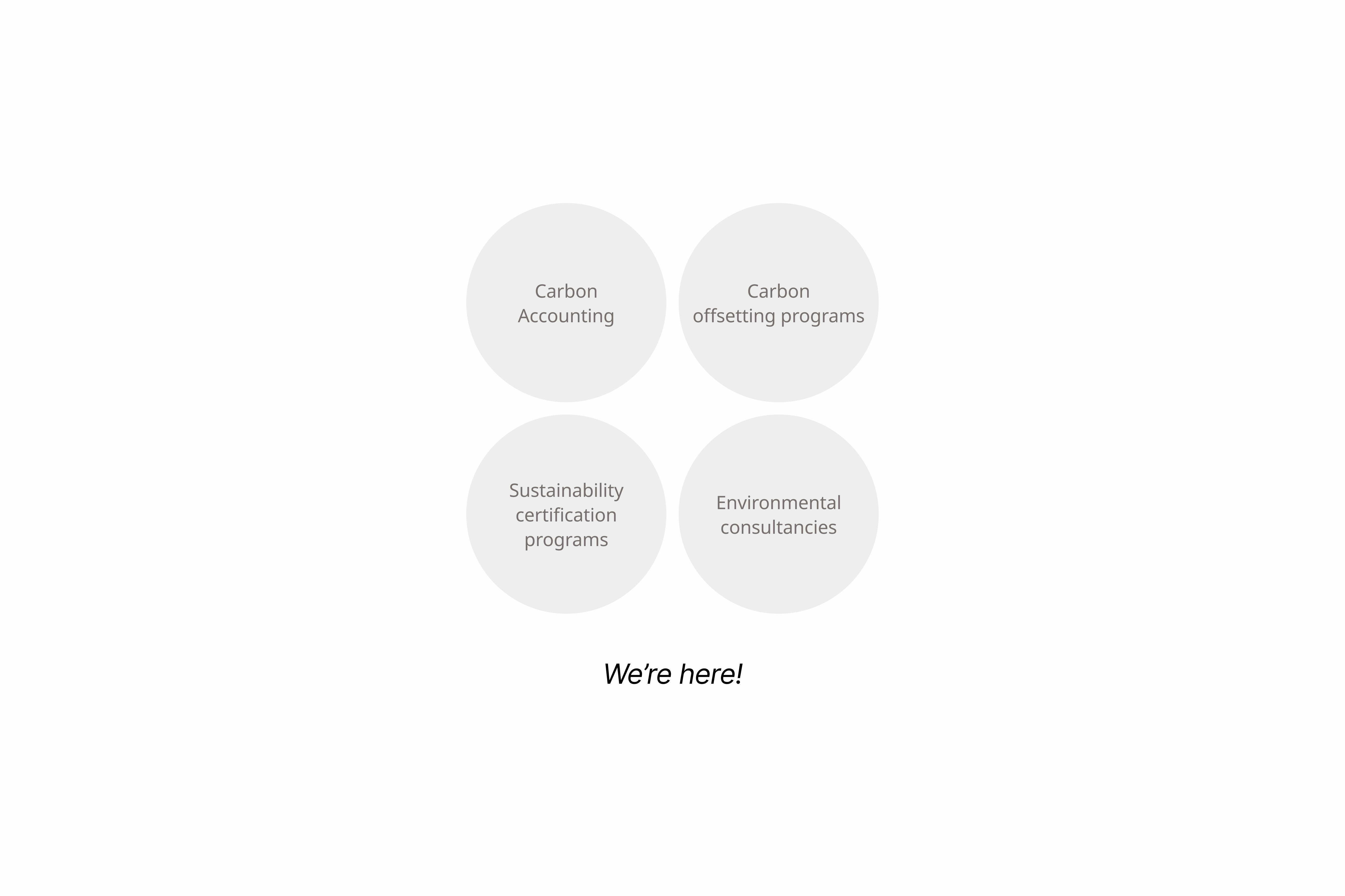
Market research &
Counter-positioning
The market research conducted by the CEO and Marketing Specialist revealed that CarbonInvoice doesn’t fit in any of the traditional categories.
We are playing in a new market where the vast majority of businesses are unaware they have a problem let alone chosen a solution. There is a need and opportunity to educate the market.
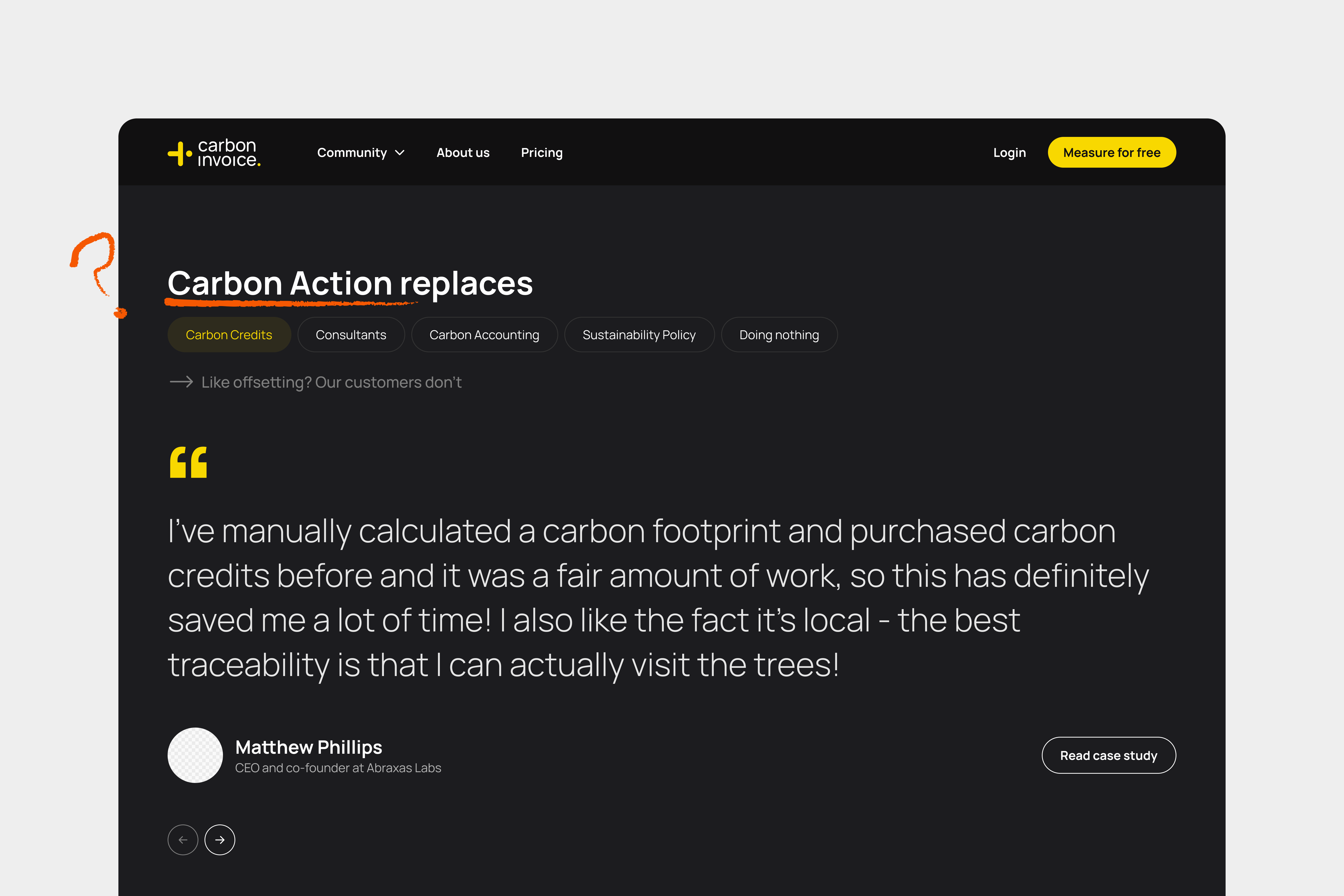
Given that CarbonInvoice doesn’t quite fit in the existing market, it was decided to move forward with a counter-positioning approach against other solutions:
Communicate unique advantages compared to traditional methods;
Narrative that highlights the simplicity of carbon action in comparison to complex environmental solutions;
Engaging myth-busting to dispel misconceptions about carbon management, emphasising that carbon action is straightforward and achievable for all businesses.
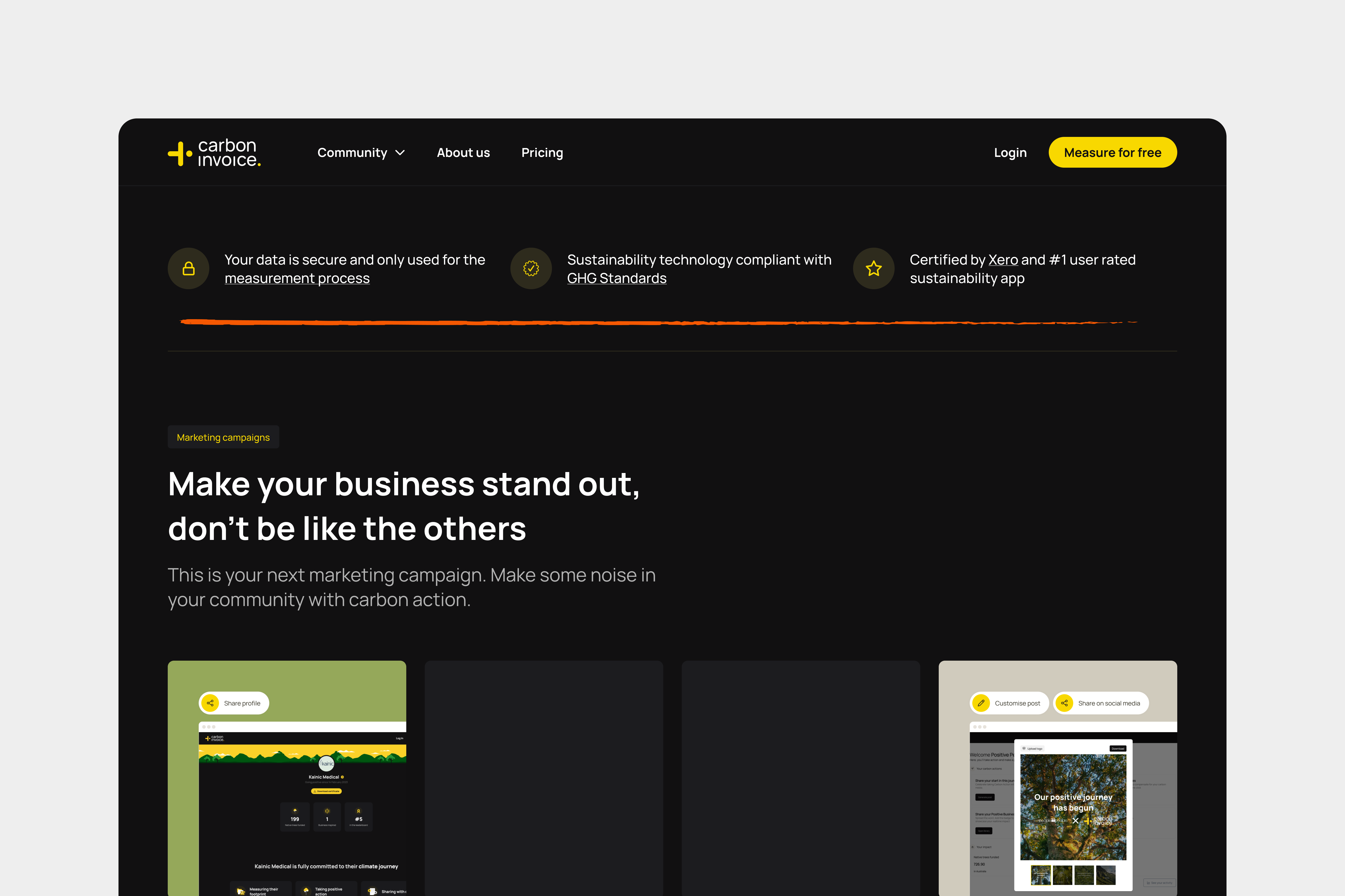
Who are we designing for?
The Rigorous Professional
Braggers are always on the lookout for the next big marketing opportunity that will set their business apart. They fund enough trees, so that they can let everyone know about it.
Relevant features: Positive Profile, Positive Badge, social media posts, and photos and videos from Planting Action Days.
The Bragger
Rigorous Professional face some procurement pressure or are working to retain government contracts. They need to be able to answer any sustainability and social procurement questions to secure that contract.
Relevant features: Positive Profile, Positive Business Certificate, sustainability slide deck and invoice AugmentationBraggers are always on the lookout for the next big marketing opportunity that will set their business apart. They fund enough trees, so that they can let everyone know about it.
Relevant features: Positive Profile, Positive Badge, social media posts, and photos and videos from Planting Action Days.
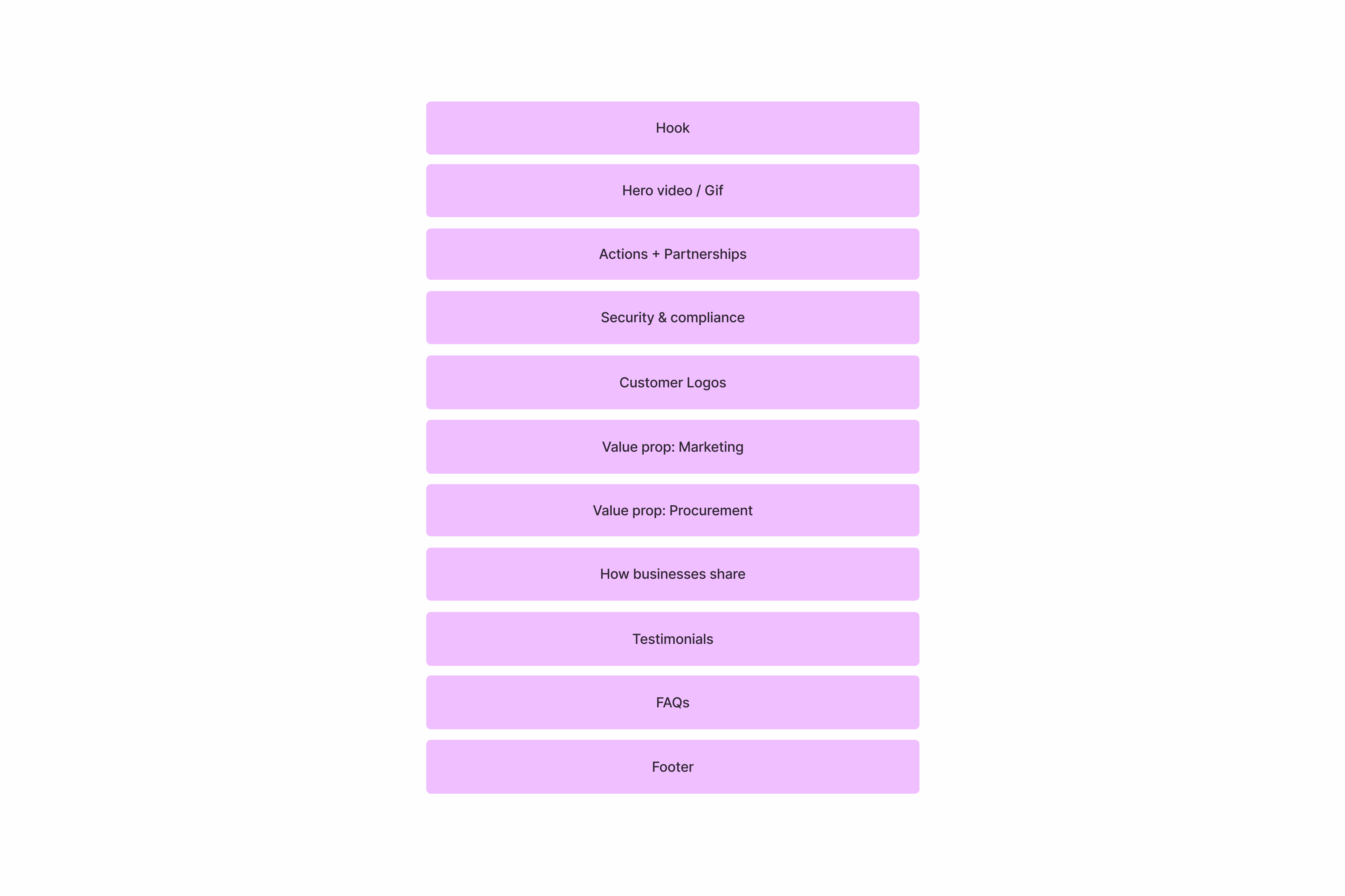
Content structure
& ideation
For this version of the website I followed the SaaS website structure.
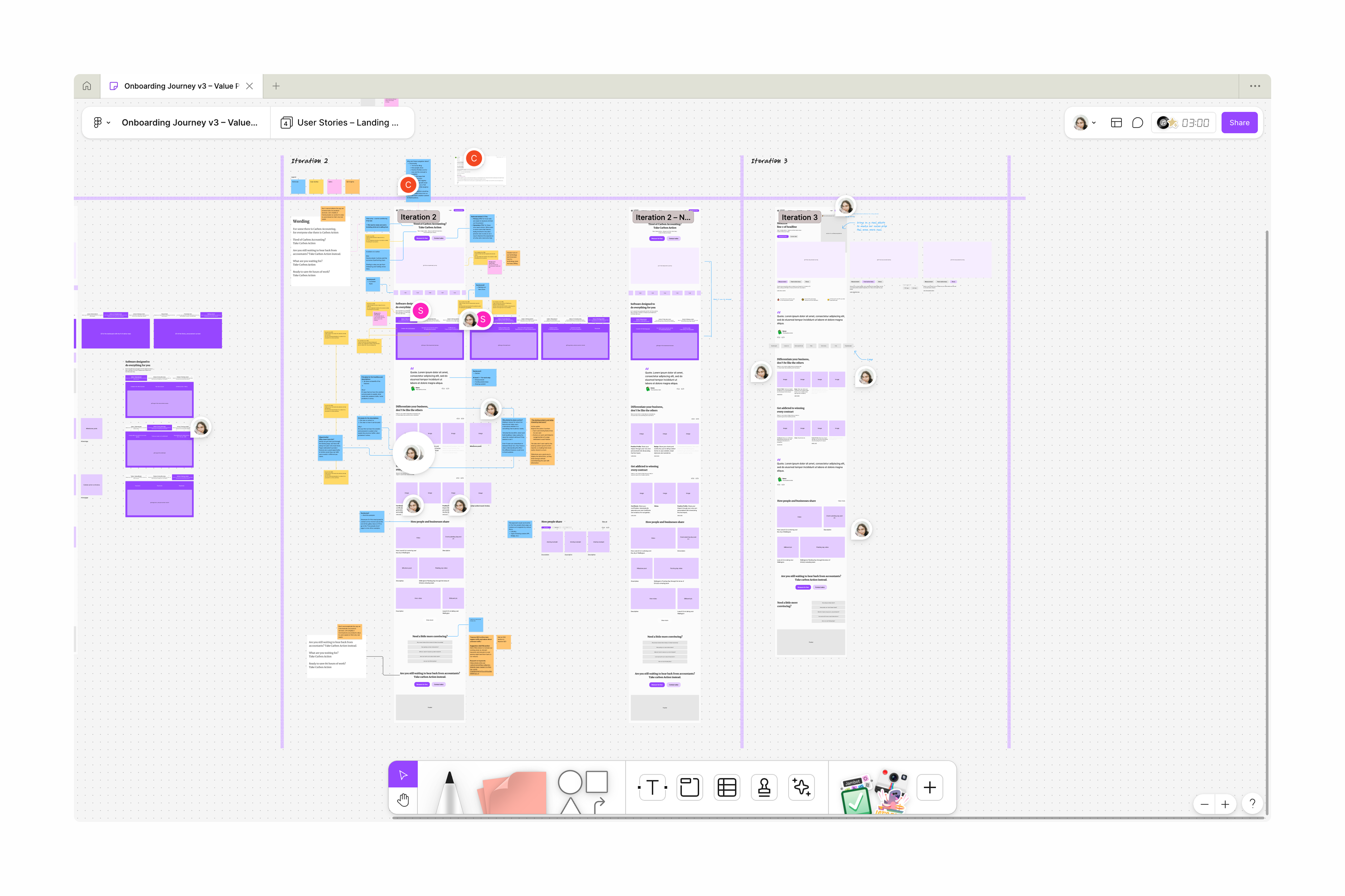
Feedback
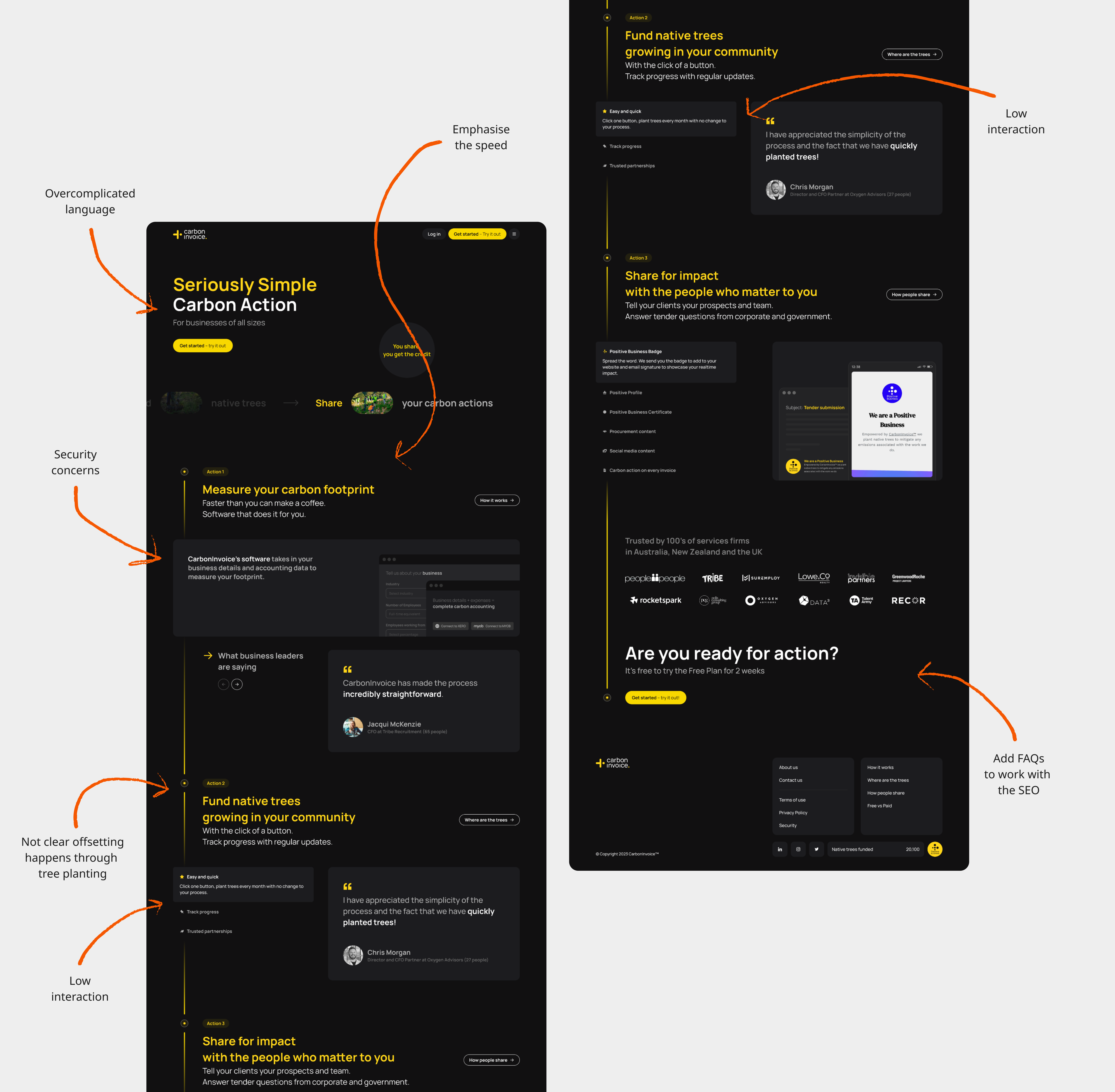
We only got feedback from stakeholders and prospects later in the design cycle. In order to meet the deadline, I had to start designing and skip feedback during the wireframes phase. However, we got feedback before I implemented the final designs.
The counter-positioning is too vague
What is carbon action? How it is relevant for prospects?
Security concerns come in too late
Have the security concerns be closer to the actual technology.
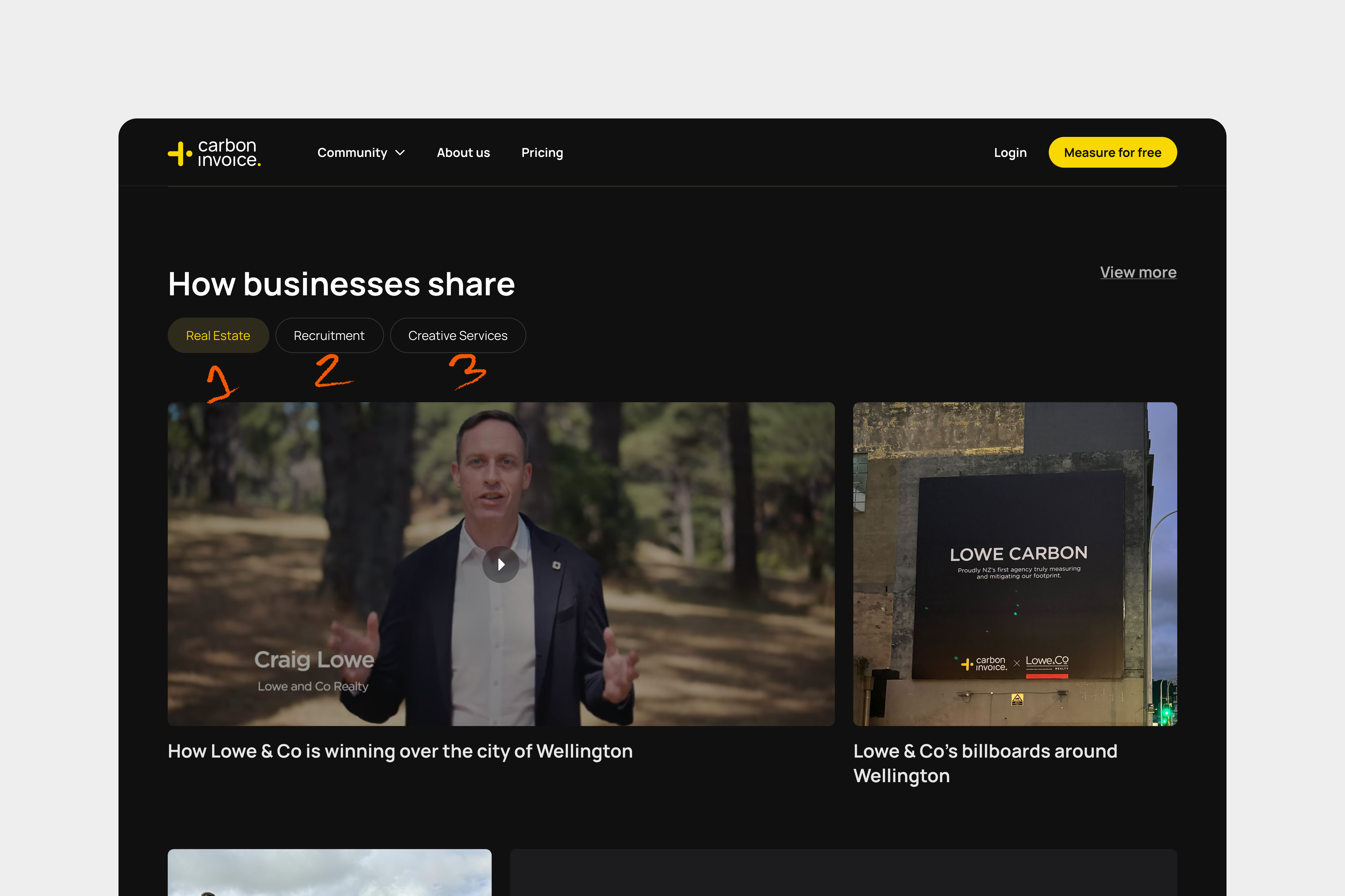
Not catering for multiple industries
We cater for multiple industries, but we're only showcasing 3 of them. This makes it seem that those are we only ones we cater to.
Final designs
and implementation
As soon as the prototype was completed I began implementing the it using Webflow. Given that most components could be re-used, it took about a week to have the landing page ready.
It went through some more rounds of feedback with stakeholders and prospects before we landed on the version in the image.
The landing page is still live today (July 2025).
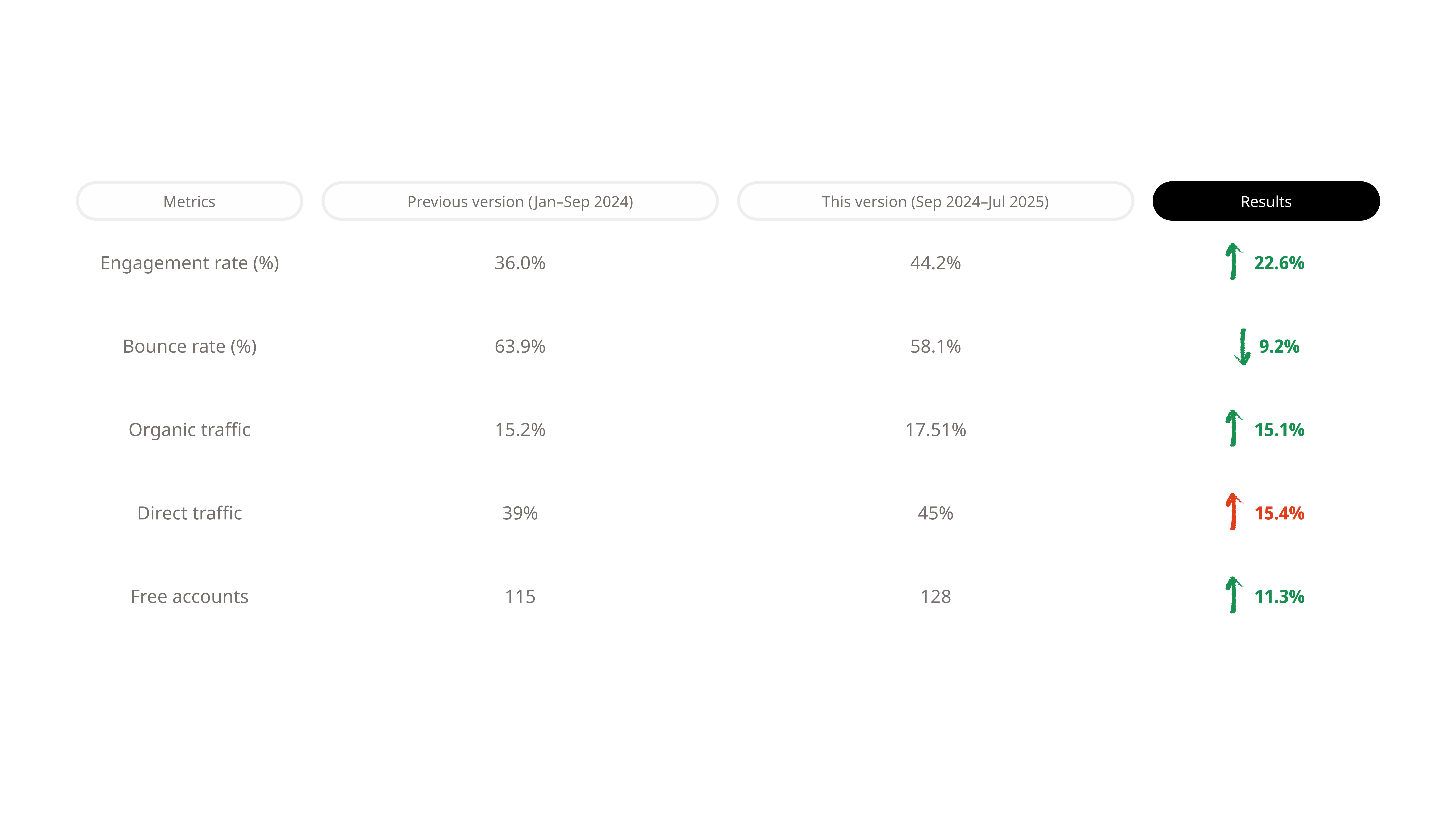
Post-launch: Performance
Tracking software had only been up for 9 months, so we don’t have data from the previous year. In general metrics are up, but we should still aim to improve them further.
Post-launch:
Interface updates
In June of 2025 I did an audit of the entire website and discovered:
Different components doing the same job
Buttons that looked the same, but had different classes;
Same font sizes with different classes;
Paragraph components acting as headings;
The most crucial SEO related changes, like headings, have been implemented, but some UI updates are still in progress.